Cercle creux ou découpé Transparent
Est-il possible de découper un cercle creux en utilisant seulement CSS?
Ce que nous pouvons tous faire:
, Mais peut-on le faire?
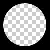
Le cercle doit être creux et transparente. Ainsi, le problème n'est pas résolu en plaçant un cercle de couleur unie sur un div.
5 réponses
Vous pouvez réaliser un cercle découpé transparent avec 2 techniques différentes:
1.SVG
Les exemples suivants utilisent un svg en ligne . Le premier extrait utilise l'élément mask pour découper le cercle transparent et le second cercle creux est réalisé avec un élément path . Le cercle est fait avec 2 commandes arc :
Avec l'élément Masque:
body{background:url('https://farm9.staticflickr.com/8760/17195790401_ceeeafcddb_o.jpg');background-size:cover;}<svg viewbox="0 0 100 50" width="100%">
<defs>
<mask id="mask" x="0" y="0" width="80" height="30">
<rect x="5" y="5" width="90" height="40" fill="#fff"/>
<circle cx="50" cy="25" r="15" />
</mask>
</defs>
<rect x="0" y="0" width="100" height="50" mask="url(#mask)" fill-opacity="0.7"/>
</svg>Avec un élément de chemin:
body{background: url('https://farm9.staticflickr.com/8760/17195790401_ceeeafcddb_o.jpg');background-size:cover;}
svg{
  display:block;
  width:70%;
  height:auto;
  margin:0 auto;
}
path{
  transition:fill .5s;
  fill:#E3DFD2;
}
path:hover{
  fill:pink;
}
<svg viewbox="-10 -1 30 12">
<path d="M-10 -1 H30 V12 H-10z M 5 5 m -5, 0 a 5,5 0 1,0 10,0 a 5,5 0 1,0 -10,0z"/>
</svg>Les principaux avantages de l'utilisation de SVG dans ce cas sont :
- code plus court
- vous pouvez facilement utiliser une image ou un dégradé pour remplir le masque de cercle
- maintenir les limites de la forme et déclencher des envents de souris uniquement sur le remplissage en respectant le masque ( survoler le cercle découpé transparent dans l'exemple)

2. CSS seulement en utilisant BOÎTE-OMBRES
Créez un div avec overflow:hidden; et un pseudo-élément rond à l'intérieur avec border-radius. Donnez-lui une énorme boîte-ombre et pas de fond:
div{
    position:relative;
    width:500px; height:200px;
    margin:0 auto;
    overflow:hidden;
}
div:after{
    content:'';
    position:absolute;
    left:175px; top:25px;
    border-radius:100%;
    width:150px; height:150px;
    box-shadow: 0px 0px 0px 2000px #E3DFD2;
}

body{background: url('https://farm9.staticflickr.com/8760/17195790401_ceeeafcddb_o.jpg');background-size:cover;}<div></div>prise en charge du Navigateur pour box-ombre est IE9+ voir canIuse
La même approche serait d'utiliser border au lieu de box-shadows. C'est intéressant si vous avez besoin de prendre en charge les borowsers qui ne supportent pas les box-shadows comme IE8. La technique est la même mais vous devez compenser avec les valeurs supérieure et gauche pour garder le cercle au centre de la div:
body{
    background: url('https://farm9.staticflickr.com/8760/17195790401_ceeeafcddb_o.jpg');
    background-size:cover;
}
div{
    position:relative;
    width:500px; height:200px;
    margin:0 auto;
    overflow:hidden;
}
div:after{
    content:'';
    position:absolute;
    left:-325px; top:-475px;
    border-radius:100%;
    width:150px; height:150px;
    border:500px solid #E3DFD2;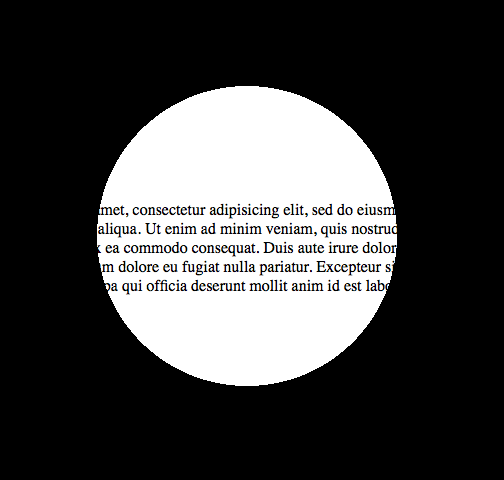
}<div></div>Cela peut être fait en utilisant un gradient radial contexte et pointeur-événements (pour permettre l'interaction de la souris derrière à travers le calque de cercle, par exemple la sélection de texte). Voici une page de démonstration et une capture d'écran:
Et ce serait le code:
<!DOCTYPE html>

<html>
<head>
<meta charset="UTF-8">
<style type="text/css" media="screen">
body {
  margin: 0;
  padding: 0;
}

.underneath {
  padding: 0;
  margin: 265px 0 0 0;
  width: 600px;
}

.overlay {
  top: 0;
  left: 0;
  position: absolute;
  width: 600px;
  height: 600px;
  background: -moz-radial-gradient(transparent 150px, rgba(0,0,0,1) 150px);
  background: -webkit-radial-gradient(transparent 150px, rgba(0,0,0,1) 150px);
  background: -ms-radial-gradient(transparent 150px, rgba(0,0,0,1) 150px);
  background: -o-radial-gradient(transparent 150px, rgba(0,0,0,1) 150px);
  pointer-events: none; /* send mouse events beneath this layer */
}
</style>
</head>
<body>

<p class="underneath">
  Lorem ipsum dolor sit amet, consectetur adipisicing elit, sed do eiusmod tempor
  incididunt ut labore et dolore magna aliqua. Ut enim ad minim veniam, quis
  nostrud exercitation ullamco laboris nisi ut aliquip ex ea commodo consequat.
  Duis aute irure dolor in reprehenderit in voluptate velit esse cillum dolore
  eu fugiat nulla pariatur. Excepteur sint occaecat cupidatat non proident, sunt
  in culpa qui officia deserunt mollit anim id est laborum.
</p>

<div class="overlay"></div>

</body>
</html>
Se référant à la réponse de web-tiki, j'aimerais ajouter que vous pouvez toujours centrer un div avec translate(-50%,-50%), donc ce ne serait pas un problème d'utiliser la propriété border, qui a un meilleur support du navigateur.
div{
    position:relative;
    width:500px;
    height:200px;
    margin:0 auto;
    overflow:hidden;
}
div:after{
    content:'';
    position:absolute;
    left:50%;
    top: 50%;
    transform: translate(-50%,-50%);
    border-radius:50%;
    width:150px; height:150px;
    border: 1000px solid rebeccapurple;
}

body{background: url('https://farm9.staticflickr.com/8760/17195790401_ceeeafcddb_o.jpg');background-size:cover;}<div></div>Vous pouvez être vraiment créatif avec cette technique:
document.addEventListener( "DOMContentLoaded", function(){
	setInterval(function(){
		if(document.getElementById("moving").style.height === "500px"){
			document.getElementById("moving").style.height = "0px";
		} else {
			document.getElementById("moving").style.height = "500px";
		}
	}, 2000);
});
#container {
width: 500px;
margin: 0 auto;
border: 1px solid black;
overflow:hidden;
position: relative;
}
#circle{
position:relative;
height:150px;
margin:0 auto;
clear:left;
overflow:hidden;
}
#circle::before, #circle::after {
content:'';
border-radius:50%;
position: absolute;
left: 50%;
top: 50%;
transform: translate(-50%,-50%);
}
#circle::before {
height: 140px;
width: 140px;
background: rebeccapurple;
}
#circle::after{
width:150px;
height:150px;
border: 2000px solid rebeccapurple;
}
#line {
margin: 0 auto;
width: 6px;
height: 200px;
position: relative;
}
#line::before, #line::after {
content: " ";
background-color: rebeccapurple;
height: 200px;
width:2000px;
position:absolute;
}
#line::before {
right: 100%;
}
#line::after {
left: 100%;
}
#moving {
height: 0px;
width: 100%;
background: blue;
transition: 2s height;
position: absolute;
top: 0px;
z-index: -1;
}
body{
background: url('https://farm9.staticflickr.com/8760/17195790401_ceeeafcddb_o.jpg');background-size:cover;
}<div id="container">
<div id="circle"></div>
<div id="line"></div>
<div id="circle"></div>
<div id="moving"></div>
</div>En ce qui concerne "Méthode 1" de "Pius Nyakoojo", avec une amélioration mineure (voir ci-dessous) cela fonctionnerait. Personnellement, je pense que c'est la solution la plus simple:
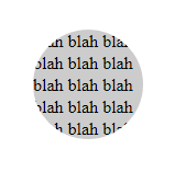
<html>
<!-- Assuming the stuff to mask is a 100 pixel square -->
<style>
.mask {
    position: absolute;
    top: -50px;                     /* minus half the div size */
    left: -50px;                    /* minus half the div size */
    width: 100px;                   /* the div size */
    height: 100px;                  /* the div size */
    background-color: transparent;
    border-radius: 100px;           /* the div size */
    border: 50px solid white;       /* half the div size */
    pointer-events: none;           /* send mouse events beneath this layer */
}

.stuff {
    position: absolute;
    width: 100px;                   /* the div size */
    height: 100px;                  /* the div size */
    overflow: hidden;               /* hide the excess of the mask border */
    background-color: #CCC;
}
</style>
<body>
    <div class="stuff">
        <div class="mask"></div>
        blah blah blah blah blah
        blah blah blah blah blah
        blah blah blah blah blah
    </div>
</body>
</html>
Méthode 1- Préféré
<div class="circle"></div>
$radius: 50px;
$thickness: 5px;

.circle {
    width: $radius;
    height: $radius;
    background-color: transparent;
    border-radius: $radius;
    border: $thickness solid gray;
}
Méthode 2
<div class="circle"></div>
$radius: 50px;
$thickness: 5px;

.circle {
  width: $radius;
  height: $radius;
}

.circle::before, .circle::after {
  margin: -2px 0;
}
.circle::before {
    content: '';
    display: inline-block;
    width: $radius;
    height: calc(#{$radius} / 2);
    background-color: transparent;
    border-top-left-radius: calc(#{$radius} / 2);
    border-top-right-radius: calc(#{$radius} / 2);
    border: $thickness solid gray;
    border-bottom: 0;

    -webkit-box-sizing: border-box;
    -moz-box-sizing: border-box;
    box-sizing: border-box;
}

.circle::after {
  content: '';
  display: inline-block;
  width: $radius;
  height: calc(#{$radius} / 2);
  background-color: transparent;
  border-bottom-left-radius: calc(#{$radius} / 2);
  border-bottom-right-radius: calc(#{$radius} / 2);
  border: $thickness solid gray;
  border-top: 0;

  -webkit-box-sizing: border-box;
  -moz-box-sizing: border-box;
  box-sizing: border-box;
}