Résumé effet sur le texte
y a-t-il des moyens dans CSS pour donner des contours à des textes de différentes couleurs ? Je veux mettre en évidence certaines parties de mon texte pour le rendre plus intuitif comme les noms, liens, etc. Changer les couleurs du lien etc. sont courantes de nos jours, donc je veux quelque chose de nouveau.
11 réponses
il y a une propriété expérimentale de webkit appelée text-stroke dans CSS3, j'ai essayé de faire en sorte que cela fonctionne depuis un certain temps, mais j'ai échoué jusqu'à présent.
ce que j'ai fait à la place est utilisé la propriété déjà supportée text-shadow (supportée dans Chrome, Firefox, Opera, et IE 9 je crois).
utilisez quatre ombres pour simuler un texte caressé:
HTML:
<div class="strokeme">
    This text should have a stroke in some browsers
</div>
CSS:
.strokeme
{
    color: white;
    text-shadow:
    -1px -1px 0 #000,
    1px -1px 0 #000,
    -1px 1px 0 #000,
    1px 1px 0 #000;
}
j'ai fait une démo pour vous ici
et un exemple en vol stationnaire est disponible ici
comme Jason C l'a mentionné dans les commentaires, la propriété text-shadow CSS est maintenant supportée par tous les principaux navigateurs, à l'exception D'Opera Mini. Où cette solution fonctionnera pour la compatibilité ascendante (pas vraiment un problème concernant les navigateurs cette mise à jour automatique) je crois que le text-stroke CSS devrait être utilisé.
Edit: text-stroke est maintenant assez mature et mis en œuvre dans la plupart des navigateurs . C'est plus facile, plus net et plus précis. Si votre public navigateur peut le supporter, vous devez maintenant utiliser text-stroke en premier, au lieu de text-shadow .
vous pouvez et devez le faire avec juste l'effet text-shadow sans aucun offsets:
.outline {
    color: #fff;
    text-shadow: #000 0px 0px 1px;
    -webkit-font-smoothing: antialiased;
}
pourquoi? Lorsque vous compensez effets d'ombre multiples, vous commencerez à remarquer des coins irréguliers et irréguliers:
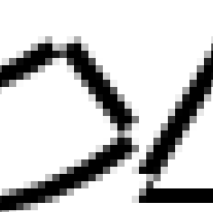
Avoir des effets d'ombre de texte dans une seule position élimine les décalages, ce qui signifie
Si vous pensez que c'est trop mince et préféreriez un contour plus foncé à la place, aucun problème - vous pouvez répéter le même effet (en gardant la même position et flou), plusieurs fois. Comme ceci:
text-shadow: #000 0px 0px 1px,   #000 0px 0px 1px,   #000 0px 0px 1px,
             #000 0px 0px 1px,   #000 0px 0px 1px,   #000 0px 0px 1px;
voici un échantillon d'un seul effet (en haut), et le même effet répété 14 fois (en bas):

note également: parce que les lignes deviennent si minces, c'est une très bonne idée de désactiver le rendu sub-pixel en utilisant
-webkit-font-smoothing: antialiased .
facile! SVG à la rescousse.
il s'agit d'une méthode simplifiée:
svg{
  font: bold 50px 'Arial';
  width: 50%;.
  height: 50px;
}

text{
  fill: none;
  stroke: red;
  stroke-width:2px;
  // stroke-dasharray: 2,2;
  stroke-linejoin: round;
}
<svg viewBox="0 0 350 50">
<text y="40">Scalable Title</text>
</svg>
Voici un de plus complexe de démonstration .
vous pourriez essayer d'empiler plusieurs ombres bleues jusqu'à ce que les ombres ressemblent à un coup, comme ça:
.shadowOutline {
  text-shadow: 0 0 4px black, 0 0 4px black, 0 0 4px black, 0 0 4px black, 0 0 4px black, 0 0 4px black, 0 0 4px black, 0 0 4px black, 0 0 4px black, 0 0 4px black, 0 0 4px black, 0 0 4px black, 0 0 4px black, 0 0 4px black, 0 0 4px black, 0 0 4px black, 0 0 4px black, 0 0 4px black, 0 0 4px black, 0 0 4px black;
}
voici un violon: http://jsfiddle.net/GGUYY /
je le mentionne juste au cas où quelqu'un serait intéressé, bien que je ne l'appellerais pas une solution parce qu'il échoue de diverses façons:
- il ne fonctionne pas dans les vieux IE
- il rend tout à fait différemment en chaque navigateur
- appliquer autant d'ombres est très lourd à traiter: s
j'étais à la recherche d'une solution de navigation croisée qui fonctionne lorsque superposée sur des images d'arrière-plan. pensez que j'ai une solution pour cela qui n'implique pas de majoration supplémentaire, js et fonctionne dans IE7-9 (Je n'ai pas testé 6), et ne cause pas de problèmes d'alias.
c'est une combinaison d'utiliser CSS3 texte-ombre, qui a un bon support sauf IE ( http://caniuse.com/#search=text-shadow ), puis en utilisant une combinaison de filtres pour IE. CSS3 la prise en charge des textos est faible pour le moment.
, c'est-Filtres
La lueur filtre ( http://www.impressivewebs.com/css3-text-shadow-ie/ ) a l'air terrible, donc je n'ai pas l'utiliser.
la réponse de David Hewitt impliquait l'ajout de filtres dropshadow dans une combinaison de directions. ClearType est alors supprimé malheureusement, nous nous retrouvons avec un texte mal aliasé.
j'ai ensuite combiné certains des éléments suggérés sur useragentman avec les filtres dropshadow.
Mettre ensemble
cet exemple serait un texte noir avec un trait blanc. J'utilise des classes HTML conditionnelles pour cibler IE ( http://paulirish.com/2008/conditional-stylesheets-vs-css-hacks-answer-neither / ).
#myelement {
    color: #000000;
    text-shadow:
    -1px -1px 0 #ffffff,
    1px -1px 0 #ffffff,
    -1px 1px 0 #ffffff,
    1px 1px 0 #ffffff;
}

html.ie7 #myelement,
html.ie8 #myelement,
html.ie9 #myelement {
    background-color: white;
    filter: progid:DXImageTransform.Microsoft.Chroma(color='white') progid:DXImageTransform.Microsoft.Alpha(opacity=100) progid:DXImageTransform.Microsoft.dropshadow(color=#ffffff,offX=1,offY=1) progid:DXImageTransform.Microsoft.dropshadow(color=#ffffff,offX=-1,offY=1) progid:DXImageTransform.Microsoft.dropshadow(color=#ffffff,offX=1,offY=-1) progid:DXImageTransform.Microsoft.dropshadow(color=#ffffff,offX=-1,offY=-1);
    zoom: 1;
}
j'ai eu de meilleurs résultats avec 6 ombres différentes:
.strokeThis{
    text-shadow:
    -1px -1px 0 #ff0,
    0px -1px 0 #ff0,
    1px -1px 0 #ff0,
    -1px 1px 0 #ff0,
    0px 1px 0 #ff0,
    1px 1px 0 #ff0;
}
ce mixin pour SASS donnera des résultats lisses, en utilisant 8 axes:
@mixin stroke($size: 1px, $color: #000) {
  text-shadow:
    -#{$size} -#{$size} 0 $color,
     0        -#{$size} 0 $color,
     #{$size} -#{$size} 0 $color,
     #{$size}  0        0 $color,
     #{$size}  #{$size} 0 $color,
     0         #{$size} 0 $color,
    -#{$size}  #{$size} 0 $color,
    -#{$size}  0        0 $color;
}
et CSS normal:
text-shadow:
  -1px -1px 0 #000,
   0   -1px 0 #000,
   1px -1px 0 #000,
   1px  0   0 #000,
   1px  1px 0 #000,
   0    1px 0 #000,
  -1px  1px 0 #000,
  -1px  0   0 #000;
h1 {
   color: black;
   -webkit-text-fill-color: white; /* Will override color (regardless of order) */
   -webkit-text-stroke-width: 1px;
   -webkit-text-stroke-color: black;
}
<h1>Properly stroked!</h1>travailler avec des traits plus épais devient un peu désordonné, si vous avez le plaisir de sass essayer ce mixin, pas parfait et en fonction du poids de trait il génère une bonne quantité de css.
 @mixin stroke($width, $colour: #000000) {
      $shadow: 0 0 0 $colour; // doesn't do anything but I couldn't work out how to create a blank string and maintain commas
      @for $i from 0 through $width {
          $shadow: $shadow,
          -$i + px -$width + px 0 $colour,
          $i + px -$width + px 0 $colour,
          -$i + px $width + px 0 $colour,
          $i + px $width + px 0 $colour,
          -$width + px -$i + px 0 $colour,
          $width + px -$i + px 0 $colour,
          -$width + px $i + px 0 $colour,
          $width + px $i + px 0 $colour,
      }
      text-shadow: $shadow;
}
texte Multiple-ombres..
Quelque chose comme ceci:
var steps = 10,
    i,
    R = 0.6,
    x,
    y,
    theStyle = '1vw 1vw 3vw #005dab';
for (i = -steps; i <= steps; i += 1) {
    x = (i / steps) / 2;
    y = Math.sqrt(Math.pow(R, 2) - Math.pow(x, 2));
    theStyle = theStyle + ',' + x.toString() + 'vw ' + y.toString() + 'vw 0 #005dab';
    theStyle = theStyle + ',' + x.toString() + 'vw -' + y.toString() + 'vw 0 #005dab';
    theStyle = theStyle + ',' + y.toString() + 'vw ' + x.toString() + 'vw 0 #005dab';
    theStyle = theStyle + ',-' + y.toString() + 'vw ' + x.toString() + 'vw 0 #005dab';
}
document.getElementsByTagName("H1")[0].setAttribute("style", "text-shadow:" + theStyle);
Voici le fichier CSS, j'espère que vous aurez wht u want
/* ----- Logo ----- */

#logo a {
    background-image:url('../images/wflogo.png');
    min-height:0;
    height:40px;
    }
* html #logo a {/* IE6 png Support */
    background-image: none;
    filter: progid:DXImageTransform.Microsoft.AlphaImageLoader(src="../images/wflogo.png", sizingMethod="crop");
}

/* ----- Backgrounds ----- */
html{
    background-image:none;  background-color:#336699;
}
#logo{
    background-image:none;  background-color:#6699cc;
}
#container, html.embed{
    background-color:#FFFFFF;
}
.safari .wufoo input.file{
    background:none;
    border:none;
}

.wufoo li.focused{
    background-color:#FFF7C0;
}
.wufoo .instruct{
    background-color:#F5F5F5;
}

/* ----- Borders ----- */
#container{
    border:0 solid #cccccc;
}
.wufoo .info, .wufoo .paging-context{
    border-bottom:1px dotted #CCCCCC;
}
.wufoo .section h3, .wufoo .captcha, #payment .paging-context{
    border-top:1px dotted #CCCCCC;
}
.wufoo input.text, .wufoo textarea.textarea{

}
.wufoo .instruct{
    border:1px solid #E6E6E6;
}
.fixed .info{
    border-bottom:none;
}
.wufoo li.section.scrollText{
    border-color:#dedede;
}

/* ----- Typography ----- */
.wufoo .info h2{
    font-size:160%;
    font-family:inherit;
    font-style:normal;
    font-weight:normal;
    color:#000000;
}
.wufoo .info div{
    font-size:95%;
    font-family:inherit;
    font-style:normal;
    font-weight:normal;
    color:#444444;
}
.wufoo .section h3{
    font-size:110%;
    font-family:inherit;
    font-style:normal;
    font-weight:normal;
    color:#000000;
}
.wufoo .section div{
    font-size:85%;
    font-family:inherit;
    font-style:normal;
    font-weight:normal;
    color:#444444;
}

.wufoo label.desc, .wufoo legend.desc{
    font-size:95%;
    font-family:inherit;
    font-style:normal;
    font-weight:bold;
    color:#444444;
}

.wufoo label.choice{
    font-size:100%;
    font-family:inherit;
    font-style:normal;
    font-weight:normal;
    color:#444444;
}
.wufoo input.text, .wufoo textarea.textarea, .wufoo input.file, .wufoo select.select{
    font-style:normal;
    font-weight:normal;
    color:#333333;
    font-size:100%;
}
{* Custom Fonts Break Dropdown Selection in IE *}
.wufoo input.text, .wufoo textarea.textarea, .wufoo input.file{
    font-family:inherit;
}


.wufoo li div, .wufoo li span, .wufoo li div label, .wufoo li span label{
    font-family:inherit;
    color:#444444;
}
.safari .wufoo input.file{ /* Webkit */
    font-size:100%;
    font-family:inherit;
    color:#444444;
}
.wufoo .instruct small{
    font-size:80%;
    font-family:inherit;
    font-style:normal;
    font-weight:normal;
    color:#444444;
}

.altInstruct small, li.leftHalf small, li.rightHalf small,
li.leftThird small, li.middleThird small, li.rightThird small,
.iphone small{
    color:#444444 !important;
}

/* ----- Button Styles ----- */

.wufoo input.btTxt{

}

/* ----- Highlight Styles ----- */

.wufoo li.focused label.desc, .wufoo li.focused legend.desc,
.wufoo li.focused div, .wufoo li.focused span, .wufoo li.focused div label, .wufoo li.focused span label,
.safari .wufoo li.focused input.file{
    color:#000000;
}

/* ----- Confirmation ----- */

.confirm h2{
    font-family:inherit;
    color:#444444;
}
a.powertiny b, a.powertiny em{
    color:#1a1a1a !important;
}
.embed a.powertiny b, .embed a.powertiny em{
    color:#1a1a1a !important;
}

/* ----- Pagination ----- */

.pgStyle1 var, .pgStyle2 var, .pgStyle2 em, .page1 .pgStyle2 var, .pgStyle1 b, .wufoo .buttons .marker{
    font-family:inherit;
    color:#444444;
}
.pgStyle1 var, .pgStyle2 td{
    border:1px solid #cccccc;
}
.pgStyle1 .done var{
    background:#cccccc;
}

.pgStyle1 .selected var, .pgStyle2 var, .pgStyle2 var em{
    background:#FFF7C0;
    color:#000000;
}
.pgStyle1 .selected var{
    border:1px solid #e6dead;
}


/* Likert Backgrounds */

.likert table{
    background-color:#FFFFFF;
}
.likert thead td, .likert thead th{
    background-color:#e6e6e6;
}
.likert tbody tr.alt td, .likert tbody tr.alt th{
    background-color:#f5f5f5;
}

/* Likert Borders */

.likert table, .likert th, .likert td{
    border-color:#dedede;
}
.likert td{
    border-left:1px solid #cccccc;
}

/* Likert Typography */

.likert caption, .likert thead td, .likert tbody th label{
    color:#444444;
    font-family:inherit;
}
.likert tbody td label{
    color:#575757;
    font-family:inherit;
}
.likert caption, .likert tbody th label{
    font-size:95%;
}

/* Likert Hover */

.likert tbody tr:hover td, .likert tbody tr:hover th, .likert tbody tr:hover label{
    background-color:#FFF7C0;
    color:#000000;
}
.likert tbody tr:hover td{
    border-left:1px solid #ccc69a;
}

/* ----- Running Total ----- */

.wufoo #lola{
    background:#e6e6e6;
}
.wufoo #lola tbody td{
    border-bottom:1px solid #cccccc;
}
.wufoo #lola{
    font-family:inherit;
    color:#444444;
}
.wufoo #lola tfoot th{
    color:#696969;
}

/* ----- Report Styles ----- */

.wufoo .wfo_graph h3{
    font-size:95%;
    font-family:inherit;
    color:#444444;
}
.wfo_txt, .wfo_graph h4{
    color:#444444;
}
.wufoo .footer h4{
    color:#000000;
}
.wufoo .footer span{
    color:#444444;
}

/* ----- Number Widget ----- */

.wfo_number{
    background-color:#f5f5f5;
    border-color:#dedede;
}
.wfo_number strong, .wfo_number em{
    color:#000000;
}

/* ----- Chart Widget Border and Background Colors ----- */

#widget, #widget body{
    background:#FFFFFF;
}
.fcNav a.show{
    background-color:#FFFFFF;
    border-color:#cccccc;
}
.fc table{
    border-left:1px solid #dedede;
}
.fc thead th, .fc .more th{
    background-color:#dedede !important;
    border-right:1px solid #cccccc !important;
}
.fc tbody td, .fc tbody th, .fc tfoot th, .fc tfoot td{
    background-color:#FFFFFF;
    border-right:1px solid #cccccc;
    border-bottom:1px solid #dedede;
}
.fc tbody tr.alt td, .fc tbody tr.alt th, .fc tbody td.alt{
    background-color:#f5f5f5;
}

/* ----- Chart Widget Typography Colors ----- */

.fc caption, .fcNav, .fcNav a{
    color:#444444;
}
.fc tfoot,
.fc thead th,
.fc tbody th div,
.fc tbody td.count, .fc .cards tbody td a, .fc td.percent var,
.fc .timestamp span{
    color:#000000;
}
.fc .indent .count{
    color:#4b4b4b;
}
.fc .cards tbody td a span{
    color:#7d7d7d;
}

/* ----- Chart Widget Hover Colors ----- */

.fc tbody tr:hover td, .fc tbody tr:hover th,
.fc tfoot tr:hover td, .fc tfoot tr:hover th{
    background-color:#FFF7C0;
}
.fc tbody tr:hover th div, .fc tbody tr:hover td, .fc tbody tr:hover var,
.fc tfoot tr:hover th div, .fc tfoot tr:hover td, .fc tfoot tr:hover var{
    color:#000000;
}

/* ----- Payment Summary ----- */

.invoice thead th,
.invoice tbody th, .invoice tbody td,
.invoice tfoot th,
.invoice .total,
.invoice tfoot .last th, .invoice tfoot .last td,
.invoice tfoot th, .invoice tfoot td{
    border-color:#dedede;
}
.invoice thead th, .wufoo .checkNotice{
    background:#f5f5f5;
}
.invoice th, .invoice td{
    color:#000000;
}
#ppSection, #ccSection{
    border-bottom:1px dotted #CCCCCC;
}
#shipSection, #invoiceSection{
    border-top:1px dotted #CCCCCC;
}

/* Drop Shadows */

/* - - - Local Fonts - - - */

/* - - - Responsive - - - */

@media only screen and (max-width: 480px) {
    html{
        background-color:#FFFFFF;
    }
    a.powertiny b, a.powertin em{
        color:#1a1a1a !important;
    }
}

/* - - - Custom Theme - - - */