Matplotlib: afficher les valeurs des tableaux avec imshow
j'essaie de créer une grille en utilisant un matplotlib function imshow.
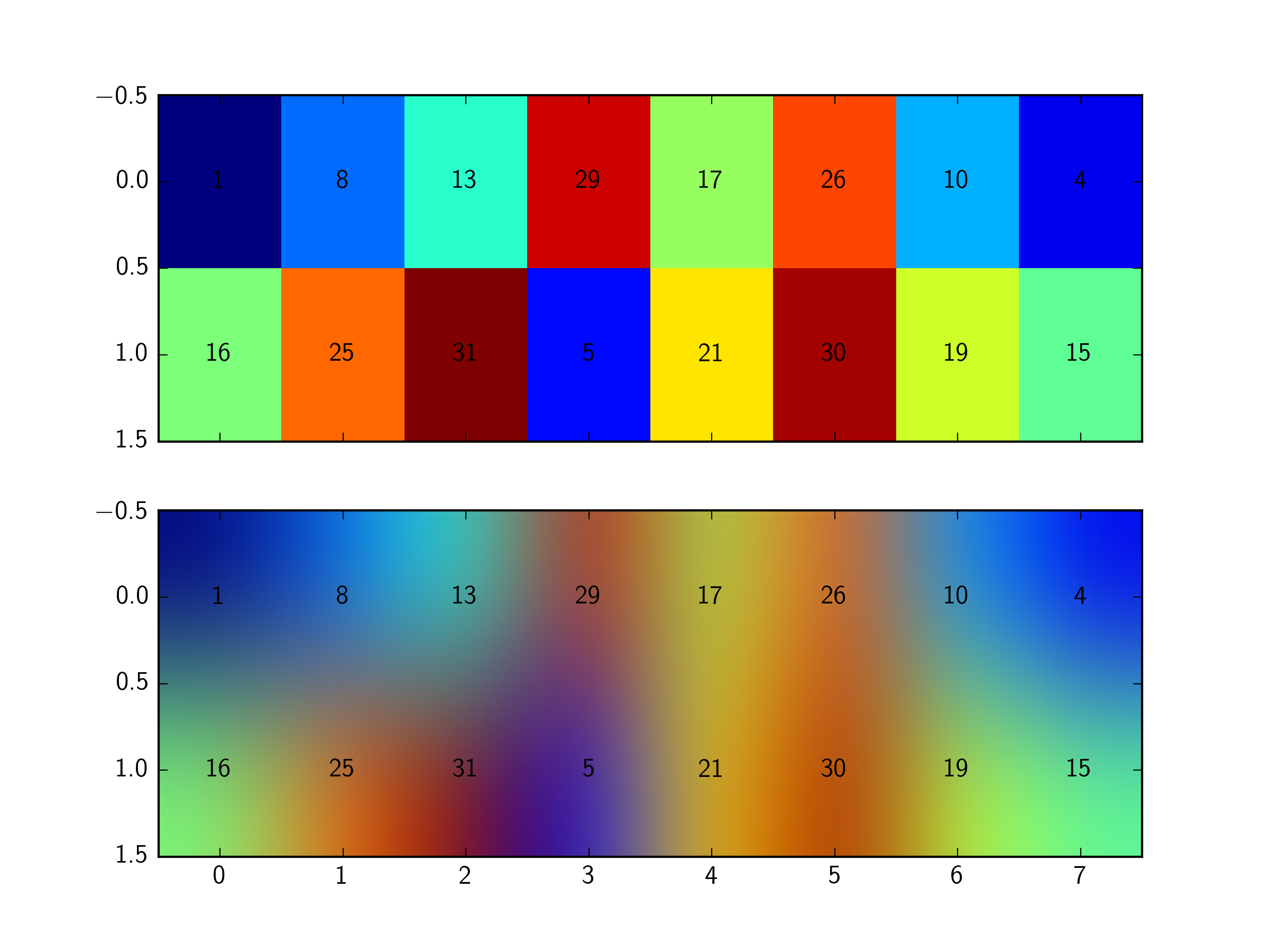
À partir de ce tableau:
[[ 1  8 13 29 17 26 10  4],
[16 25 31  5 21 30 19 15]]
je voudrais tracer la valeur comme une couleur et la valeur texte elle-même (1,2, ...) sur la même grille. C'est ce que j'ai pour le moment (je ne peux que le tracé de la couleur associée à chaque valeur):
from matplotlib import pyplot
import numpy as np

grid = np.array([[1,8,13,29,17,26,10,4],[16,25,31,5,21,30,19,15]])
print 'Here is the array'
print grid

fig1, (ax1, ax2)= pyplot.subplots(2, sharex = True, sharey = False)
ax1.imshow(grid, interpolation ='none', aspect = 'auto')
ax2.imshow(grid, interpolation ='bicubic', aspect = 'auto')
pyplot.show()
2 réponses
Si pour une raison quelconque, vous devez utiliser un manière de celui qui est fourni naturellement par imshow la méthode suivante (même si plus factice) fait le travail:
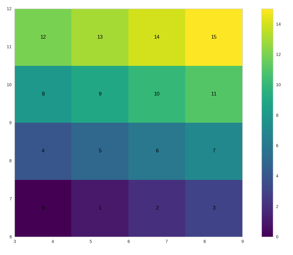
size = 4
data = np.arange(size * size).reshape((size, size))

# Limits for the extent
x_start = 3.0
x_end = 9.0
y_start = 6.0
y_end = 12.0

extent = [x_start, x_end, y_start, y_end]

# The normal figure
fig = plt.figure(figsize=(16, 12))
ax = fig.add_subplot(111)
im = ax.imshow(data, extent=extent, origin='lower', interpolation='None', cmap='viridis')

# Add the text
jump_x = (x_end - x_start) / (2.0 * size)
jump_y = (y_end - y_start) / (2.0 * size)
x_positions = np.linspace(start=x_start, stop=x_end, num=size, endpoint=False)
y_positions = np.linspace(start=y_start, stop=y_end, num=size, endpoint=False)

for y_index, y in enumerate(y_positions):
    for x_index, x in enumerate(x_positions):
        label = data[y_index, x_index]
        text_x = x + jump_x
        text_y = y + jump_y
        ax.text(text_x, text_y, label, color='black', ha='center', va='center')

fig.colorbar(im)
plt.show()
si vous voulez mettre autres types de données et pas nécessairement les valeurs que vous avez utilisé pour l'image vous pouvez modifier le script ci-dessus de la manière suivante (valeurs ajoutées après de données):
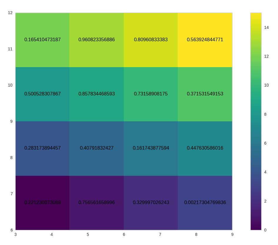
size = 4
data = np.arange(size * size).reshape((size, size))
values = np.random.rand(size, size)

# Limits for the extent
x_start = 3.0
x_end = 9.0
y_start = 6.0
y_end = 12.0

extent = [x_start, x_end, y_start, y_end]

# The normal figure
fig = plt.figure(figsize=(16, 12))
ax = fig.add_subplot(111)
im = ax.imshow(data, extent=extent, origin='lower', interpolation='None', cmap='viridis')

# Add the text
jump_x = (x_end - x_start) / (2.0 * size)
jump_y = (y_end - y_start) / (2.0 * size)
x_positions = np.linspace(start=x_start, stop=x_end, num=size, endpoint=False)
y_positions = np.linspace(start=y_start, stop=y_end, num=size, endpoint=False)

for y_index, y in enumerate(y_positions):
    for x_index, x in enumerate(x_positions):
        label = values[y_index, x_index]
        text_x = x + jump_x
        text_y = y + jump_y
        ax.text(text_x, text_y, label, color='black', ha='center', va='center')

fig.colorbar(im)
plt.show()
vous voulez boucler les valeurs dans grid, et utiliser ax.text pour ajouter l'étiquette de la parcelle.
heureusement, pour les matrices 2D,numpy a ndenumerate, ce qui rend cela assez simple:
for (j,i),label in np.ndenumerate(grid):
    ax1.text(i,j,label,ha='center',va='center')
    ax2.text(i,j,label,ha='center',va='center')