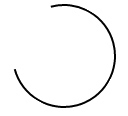
Est-il possible de dessiner un contour de cercle partiel en CSS (forme d'anneau ouvert)?
je suis intéressé à créer une rotation de chargement entièrement en CSS, mais pour ce faire, j'aurais besoin de pouvoir dessiner une forme d'anneau ouvert comme ceci:

l'anneau se dessinerait autour de la circonférence du cercle. Est-ce réalisable dans les CSS?
4 réponses
pour créer un cercle qui dessine peu à peu son chemin extérieur, utilisez SVG.
La propriété SVG stroke-dasharray transformera n'importe quel chemin en ligne pointillée, que vous pouvez utiliser à votre avantage en paramétrant la taille du tiret pour être presque aussi long que le chemin lui-même.
utilisez ensuite une animation CSS pour changer graduellement le stroke-dashoffset pour déplacer le tableau de bord autour du périmètre de votre cercle.
circle {
  fill: white;
  stroke: black;
  stroke-width: 2;
  stroke-dasharray: 250;
  stroke-dashoffset: 1000;
  animation: rotate 5s linear infinite;
}

@keyframes rotate {
  to {
    stroke-dashoffset: 0;
  }
}
<svg height="100" width="100">
<circle cx="50" cy="50" r="40" />
</svg>Image Statique
un exemple simplifié qui ne repose que sur un seul élément HTML et une seule classe CSS pourrait ressembler à ceci:
.arc {
  /* Border size and color */
  border: 2px solid #000;
  /* Creates a circle */
  border-radius: 50%;
  /* Circle size */
  height: 100px;
  width: 100px;
  /* Use transparent borders to define opening (more transparent = larger opening) */
  border-top-color: transparent;
  border-left-color: transparent;
  /* Use transform to rotate to adjust where opening appears */
  transform: rotate(300deg)
}
exemple
.arc {
  border: 2px solid #000;
  border-radius: 50%;
  height: 100px;
  width: 100px;
  border-top-color: transparent;
  transform: rotate(300deg)
}
<div class='arc'></div>Image Tournante
, Vous pouvez appliquer une rotation de base à la précédent exemple statique en profitant des animations basées sur CSS en utilisant @keyframes :
.arc {
  /* Border size and color */
  border: 2px solid #000;
  /* Creates a circle */
  border-radius: 50%;
  /* Circle size */
  height: 100px;
  width: 100px;
  /* Use transparent borders to define opening (more transparent = larger opening) */
  border-top-color: transparent;
  /* Rotate indefinitely (longer time = slower rotation) */
  animation: rotate 2s infinite linear;
}

@keyframes rotate {
  0%    { transform: rotate(0deg);  }
  100%  { transform: rotate(360deg);  }
}
exemple

.arc {
  border: 2px solid #000;
  border-radius: 50%;
  height: 100px;
  width: 100px;
  border-top-color: transparent;
  animation: rotate 2s infinite linear;
}

@keyframes rotate {
  0%    { transform: rotate(0deg);  }
  100%  { transform: rotate(360deg);  }
}
<div class='arc'></div>dessin (sans SVG)
une Autre approche que je suis tombé sur , tout n'est pas aussi élégant que le les approches précédentes semblent produire l'effet désiré. Dans implique l'utilisation de plusieurs animations ainsi que de montrer/cacher différentes sections du cercle si nécessaire.
l'extrait de code contient un exemple qui le démontre.
exemple
#container {
  position: absolute;
  width: 100px;
  height: 100px;
  animation: colors 1s infinite;
}
#halfclip {
  width: 50%;
  height: 100%;
  right: 0px;
  position: absolute;
  overflow: hidden;
  transform-origin: left center;
  animation: cliprotate 4s steps(2) infinite;
  -webkit-animation: cliprotate 4s steps(2) infinite;
}
.halfcircle {
  box-sizing: border-box;
  height: 100%;
  right: 0px;
  position: absolute;
  border: solid 2px transparent;
  border-top-color: #000;
  border-left-color: #000;
  border-radius: 50%;
}
#clipped {
  width: 200%;
  animation: rotate 2s linear infinite;
  -webkit-animation: rotate 2s linear infinite;
}
#fixed {
  width: 100%;
  transform: rotate(135deg);
  animation: showfixed 4s steps(2) infinite;
  -webkit-animation: showfixed 4s linear infinite;
}
@-webkit-keyframes cliprotate {
  0% {
    transform: rotate(0deg);
  }
  100% {
    transform: rotate(360deg);
  }
}
@keyframes cliprotate {
  0% {
    transform: rotate(0deg);
  }
  100% {
    transform: rotate(360deg);
  }
}
@-webkit-keyframes rotate {
  0% {
    transform: rotate(-45deg);
  }
  100% {
    transform: rotate(135deg);
  }
}
@keyframes rotate {
  0% {
    transform: rotate(-45deg);
  }
  100% {
    transform: rotate(135deg);
  }
}
@-webkit-keyframes showfixed {
  0% {
    opacity: 0;
  }
  49.9% {
    opacity: 0;
  }
  50% {
    opacity: 1;
  }
  100% {
    opacity: 1;
  }
}
<div id="container">
<div id="halfclip">
<div class="halfcircle" id="clipped">
</div>
</div>
<div class="halfcircle" id="fixed">
</div>
</div>dessin (avec SVG)
profiter de SVG est probablement le meilleur moyen de résoudre ce problème, car il est explicitement conçu pour gérer le dessin dans le navigateur. Je recommande vivement cette approche si le support SVG est disponible.
Dylan réponse les détails de ce que cette mise en œuvre pourrait ressembler.
vous pouvez simplement prendre un pseudo-élément ::after pour créer la partie ouverte, avec juste le chevauchement de l'élément de cercle. L'avantage est que la partie ouverte peut être aussi longue que souhaité (pas limité à un 3/4 cercle).
.circle {
  width: 100px;
  height: 100px;
  border: 2px solid;
  border-radius: 50%;
  margin: 30px;
  animation: rotate 1s infinite linear;
}
.circle::after {
  content: "";
  display: block;
  width: 80px;
  height: 80px;
  background: white;
  border-radius: 50%;
  margin: -30% 0 0 -30%;
}
@keyframes rotate {
  0%    { transform: rotate(0deg);  }
  100%  { transform: rotate(360deg);  }
}
<div class="circle"></div> pour la version pseudo, Vous pouvez également utiliser linear-gradient (l'ombre peut être diminuée ou augmentée) et background-clip ,
où elle est disponible, mix-blend-mode peut la rendre translucide,
currentcolor et animation peut également être utilisé pour animer la couleur :
.loader {
  font-size: 1.5em;
  color: gray;
  position: relative;
  padding: 3px;
  /* make a square */
  height: 100px;
  width: 100px;
  /* center content*/
  display: flex;
  align-items: center;
  justify-content: center;
  animation: coloranim infinite 5s;
}

.circle {
  border-radius: 100%;
  overflow: hidden;
}

.loader:after {
  border-radius: inherit;
  color: inherit;
  content: '';
  position: absolute;
  top: 0;
  bottom: 0;
  left: 0;
  right: 0;
  padding: 3px;
  background: linear-gradient(white, white), linear-gradient(0deg, transparent 40%, currentcolor 60%), linear-gradient(50deg, transparent 50%, currentcolor 52%);
  background-clip: content-box, border-box, border-box;
  z-index: -1;
  mix-blend-mode: multiply;/* if avalaible, else bg remains white */
}

.spin:after {
  animation: spin 2s linear infinite;
}

@keyframes spin {
  to {
    transform: rotate(360deg);
  }
}

@keyframes coloranim {
  20% {
    color: tomato;
  }
  40% {
    color: purple;
  }
  60% {
    color: turquoise;
  }
  80% {
    color: green;
  }
}


/* demo purpose, use your own style wherever your loader is needed */

html {
  height: 100%;
  display: flex;
  background: url(http://lorempixel.com/800/800/food/3);
  background-size: cover;
  box-shadow: inset 0 0 0 2000px rgba(255, 255, 255, 0.3)
}

body {
  margin: auto;
}
<div class="spin circle loader coloranim"> loading... </div>