Comment superposer scatterplots en R?
Si j'ai trois ensembles de données :
a1= rnorm(10)
a2= rnorm(10)
a3= rnorm(10)
par(mfrow=c(1,3))
plot(a1)
plot(a2)
plot(a3)
Comment puis-je obtenir tous ces points sur la même parcelle?
3 réponses
points fonction:
plot(a1)
points(a2, col=2)
points(a3, col=3)
C'est équivalent à:
plot(1:length(a1), a1)
points(1:length(a2), a2, col=2)
points(1:length(a3), a3, col=3)
si les vecteurs ont des longueurs inégales, alors vous devez spécifier la limite de l'axe des x:
plot(a1, xlim=c(1, max(length(a1), length(a2), length(a3))))
# To overlay scatterplots in R

# import the required libraries
library(ggplot2)
library(reshape2)

# assign data
a1=rnorm(10)
a2=rnorm(10)
a3=rnorm(10)

# create a dataframe from combined data
# and set count to however many points are in each dataset
df = data.frame(a1, a2, a3, count = c(1:10))

# melt the dataframe
df.m = melt(df, id.vars ="count", measure.vars = c("a1","a2","a3"))

# take a look at what melt() does to get an idea of what is going on
df.m

# plot out the melted dataframe using ggplot
ggplot(df.m, aes(count, value, colour = variable)) + geom_point() + ylim(-3,3)

# swapping the axis
ggplot(df.m, aes(value, count, colour = variable)) + geom_point() + xlim(-3,3)
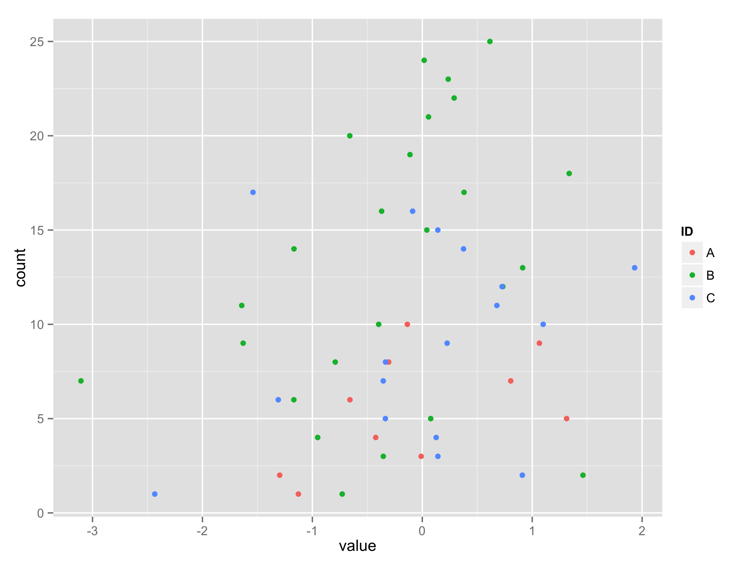
Quand a1 et a3 ont la même taille, il n'est pas possible de mettre dans le même data.frame comme colonnes, comme entrées pour melt. La solution est d'utiliser simplement un list:
a1 = rnorm(10)
a2 = rnorm(25)
a3 = rnorm(17)
a_list = list(a1, a2, a3)
a_df = do.call("rbind", lapply(a_list,
                                function(x) data.frame(value = x,
                                                       count = seq_along(x))))
ID_options = LETTERS[seq_along(a_list)]
a_df$ID = rep(ID_options, sapply(a_list, length))
ggplot(a_df, aes(x = value, y = count, color = ID)) + geom_point()
pour ajouter de la variété aux réponses, vous pouvez aussi utiliser lattice. Ici, la deuxième ligne de chaque série d'échantillons de code représenter échangé axes.
library(lattice)

## If you have already created the "df"
##   data.frame from your example
xyplot(count ~ a1 + a2 + a3, data=df)
xyplot(a1 + a2 + a3 ~ count, data=df)

## Without first creating the "df"
##   data.frame from your example
xyplot(1:10 ~ a1 + a2 + a3)
xyplot(a1 + a2 + a3 ~ 1:10)
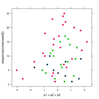
Si vous travaillez avec des vecteurs de longueurs inégales, vous pouvez charger les fonctions de cette réponse j'ai partagé sur cbinding vecteurs de longueurs inégales puis utilisez la première approche que j'ai mentionnée. mise à Jour: voir https://gist.github.com/mrdwab/6789277 pour la plupart les versions récentes de la fonction.
Exemple:
a1 = rnorm(10)
a2 = rnorm(25)
a3 = rnorm(17)

library(lattice)
library(devtools)
## source_gist is not working properly unless you provide
##   the full URL to the "raw" file
source_gist("https://gist.github.com/mrdwab/6789277/raw/9bd7d5931389ec475c49c1918d26d9899796a5d0/Cbind.R")

newdf <- Cbind(a1, a2, a3)
xyplot(a1 + a2 + a3 ~ sequence(nrow(newdf)), data=newdf)
xyplot(sequence(nrow(newdf)) ~ a1 + a2 + a3, data=newdf)
voici un exemple de graphe avec un peu d'ajustements aux couleurs par défaut:
xyplot(sequence(nrow(newdf)) ~ a1 + a2 + a3, data=newdf,
       pch = 21, fill = c("black", "red", "green"), cex = 1)