Comment créer une barre de progression de Style circulaire
j'ai besoin d'aide sur la mise en œuvre d'une circulaire de la barre de progression comme ceci:
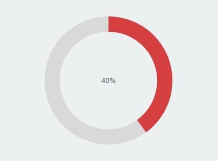
comment mettre en oeuvre le cercle à remplir en augmentant Value propriété?
4 réponses
Vous avez quelques options - la première est de template Le ProgressBar de contrôle. Cela s'avère être un peu délicat. J'ai écrit un billet de blog qui décrit comment utilisez un modèle de vue attaché pour obtenir l'effet requis.
L'autre solution consiste à créer votre propre contrôle à partir de zéro. Vous pouvez faire ce qui suit:
- Créer un nouveau contrôle de l'utilisateur
- ajouter une nouvelle valeur, des propriétés de dépendances Maximum et Minimum à il.
- gérer la valeur, le Maximum et le Minimum des événements de changement de propriété dans votre contrôle d'utilisateur pour calculer une propriété Angle.
- construisez deux 'morceaux de tarte' en code derrière (voir ce post) et les ajouter à l'INTERFACE utilisateur.
C'est un peu délicat, mais pas impossible. Voici l'implémentation de my en utilisant des animations smooth pour guider. Les convertisseurs de valeurs doivent être utilisés pour créer une barre de progression circulaire.
CircularProgressBar.cs
 public partial class CircularProgressBar : ProgressBar
{
    public CircularProgressBar()
    {
        this.ValueChanged += CircularProgressBar_ValueChanged;
    }

    void CircularProgressBar_ValueChanged(object sender, RoutedPropertyChangedEventArgs<double> e)
    {
        CircularProgressBar bar = sender as CircularProgressBar;
        double currentAngle = bar.Angle;
        double targetAngle = e.NewValue / bar.Maximum * 359.999;

        DoubleAnimation anim = new DoubleAnimation(currentAngle, targetAngle, TimeSpan.FromMilliseconds(500));
        bar.BeginAnimation(CircularProgressBar.AngleProperty, anim, HandoffBehavior.SnapshotAndReplace);
    }

    public double Angle
    {
        get { return (double)GetValue(AngleProperty); }
        set { SetValue(AngleProperty, value); }
    }

    // Using a DependencyProperty as the backing store for Angle.  This enables animation, styling, binding, etc...
    public static readonly DependencyProperty AngleProperty =
        DependencyProperty.Register("Angle", typeof(double), typeof(CircularProgressBar), new PropertyMetadata(0.0));

    public double StrokeThickness
    {
        get { return (double)GetValue(StrokeThicknessProperty); }
        set { SetValue(StrokeThicknessProperty, value); }
    }

    // Using a DependencyProperty as the backing store for StrokeThickness.  This enables animation, styling, binding, etc...
    public static readonly DependencyProperty StrokeThicknessProperty =
        DependencyProperty.Register("StrokeThickness", typeof(double), typeof(CircularProgressBar), new PropertyMetadata(10.0));
}
AngleToPointConverter.cs
class AngleToPointConverter : IValueConverter
{

    public object Convert(object value, Type targetType, object parameter, System.Globalization.CultureInfo culture)
    {
        double angle = (double)value;
        double radius = 50;
        double piang = angle * Math.PI / 180;

        double px = Math.Sin(piang) * radius + radius;
        double py = -Math.Cos(piang) * radius + radius;

        return new Point(px, py);
    }

    public object ConvertBack(object value, Type targetType, object parameter, System.Globalization.CultureInfo culture)
    {
        throw new NotImplementedException();
    }
}
AngleToIsLargeConverter.cs
class AngleToIsLargeConverter : IValueConverter
{

    public object Convert(object value, Type targetType, object parameter, System.Globalization.CultureInfo culture)
    {
        double angle = (double)value;

        return angle > 180;
    }

    public object ConvertBack(object value, Type targetTypes, object parameter, System.Globalization.CultureInfo culture)
    {
        throw new NotImplementedException();
    }
}
App.xaml
<Application x:Class="WpfApplication1.App"
         xmlns="http://schemas.microsoft.com/winfx/2006/xaml/presentation"
         xmlns:x="http://schemas.microsoft.com/winfx/2006/xaml"
         StartupUri="MainWindow.xaml"
         xmlns:my="clr-namespace:WpfApplication1">
<Application.Resources>
    <my:AngleToPointConverter x:Key="prConverter"/>
    <my:AngleToIsLargeConverter x:Key="isLargeConverter"/>

    <Style x:Key="circularProgressBar" TargetType="my:CircularProgressBar">
        <Setter Property="Value" Value="10"/>
        <Setter Property="Maximum" Value="100"/>
        <Setter Property="StrokeThickness" Value="10"/>
        <Setter Property="Template">
            <Setter.Value>
                <ControlTemplate TargetType="my:CircularProgressBar">
                        <Canvas Width="100" Height="100">
                        <Ellipse Width="100" Height="100" Stroke="LightGray"
                                     StrokeThickness="1"/>

                        <Path Stroke="{TemplateBinding Background}"
                                  StrokeThickness="{TemplateBinding StrokeThickness}">
                                <Path.Data>
                                    <PathGeometry>
                                        <PathFigure x:Name="fig" StartPoint="50,0">
                                            <ArcSegment RotationAngle="0" SweepDirection="Clockwise"
                                                        Size="50,50"
                                                        Point="{Binding Path=Angle, Converter={StaticResource prConverter}, RelativeSource={RelativeSource FindAncestor, AncestorType=ProgressBar}}"
                                                        IsLargeArc="{Binding Path=Angle, Converter={StaticResource isLargeConverter}, RelativeSource={RelativeSource FindAncestor, AncestorType=ProgressBar}}"
                                                        >
                                            </ArcSegment>
                                        </PathFigure>
                                    </PathGeometry>
                                </Path.Data>
                            </Path>
                            <Border Width="100" Height="100">
                                <TextBlock Foreground="Gray" HorizontalAlignment="Center" VerticalAlignment="Center"
                                       Text="{Binding Path=Value, StringFormat={}%{0},
                                RelativeSource={RelativeSource TemplatedParent}}"
                                           FontSize="{TemplateBinding FontSize}"/>
                            </Border>
                        </Canvas>

                </ControlTemplate>
            </Setter.Value>
        </Setter>
    </Style>
</Application.Resources>
il peut être plus personnalisé en ajoutant quelques propriétés supplémentaires telles que InnerRadius, Radius etc.
Avez-vous regardé ValueConverter s? Vous pouvez vous lier à la propriété Value dans le modèle en utilisant TemplateBinding et utilisez un convertisseur de valeurs approprié pour changer la valeur en whats est utile pour une barre de progression circulaire.
EDIT:
Dans le template:
Ajouter un cercle remplir de jaune.
Ajouter un autre cercle sur le dessus avec la couleur orange.
Utiliser un convertisseur de valeurs(ou de plusieurs valeurs convertisseur) retourner une géométrie de coupure (en utilisant éventuellement un segment d'arc) pour le cercle ajouté en 2.
Couper le cercle en 2. avec la géométrie retournée en 3.
Downvoter me donne mon repz dos.
je sais que c'est un vieux problème, mais de toute façon, voici ma solution:
POUR WINFORMS:
using System;
using System.Drawing;
using System.Drawing.Drawing2D;
using System.Windows.Forms;

public class CircularProgressBar : Control
{
    /*  CREDITS:
     *  Autor: Sajjad Arif Gul / October 12, 2016 / C#, Source Codes
     *  https://www.csharpens.com/c-sharp/circular-progress-bar-in-c-sharp-windows-form-applications-23/
     *  Modified by Jhollman Chacon, 2017 */

#region Enums

public enum _ProgressShape
{
    Round,
    Flat
}

#endregion

#region Variables

private long _Value;
private long _Maximum = 100;
private Color _ProgressColor1 = Color.Orange;
private Color _ProgressColor2 = Color.Orange;
private Color _LineColor = Color.Silver;
private _ProgressShape ProgressShapeVal;

#endregion

#region Custom Properties

public long Value
{
    get { return _Value; }
    set
    {
        if (value > _Maximum)
            value = _Maximum;
        _Value = value;
        Invalidate();
    }
}

public long Maximum
{
    get { return _Maximum; }
    set
    {
        if (value < 1)
            value = 1;
        _Maximum = value;
        Invalidate();
    }
}

public Color ProgressColor1
{
    get { return _ProgressColor1; }
    set
    {
        _ProgressColor1 = value;
        Invalidate();
    }
}

public Color ProgressColor2
{
    get { return _ProgressColor2; }
    set
    {
        _ProgressColor2 = value;
        Invalidate();
    }
}

public Color LineColor
{
    get { return _LineColor; }
    set
    {
        _LineColor = value;
        Invalidate();
    }
}

public _ProgressShape ProgressShape
{
    get { return ProgressShapeVal; }
    set
    {
        ProgressShapeVal = value;
        Invalidate();
    }
}

#endregion

#region EventArgs

protected override void OnResize(EventArgs e)
{
    base.OnResize(e);
    SetStandardSize();
}

protected override void OnSizeChanged(EventArgs e)
{
    base.OnSizeChanged(e);
    SetStandardSize();
}

protected override void OnPaintBackground(PaintEventArgs p)
{
    base.OnPaintBackground(p);
}

#endregion

#region Methods
public CircularProgressBar()
{
    Size = new Size(130, 130);
    Font = new Font("Segoe UI", 15);
    MinimumSize = new Size(100, 100);
    DoubleBuffered = true;
    Value = 57;
    ProgressShape = _ProgressShape.Flat;
    this.ForeColor = Color.DimGray;
}

private void SetStandardSize()
{
    int _Size = Math.Max(Width, Height);
    Size = new Size(_Size, _Size);
}

public void Increment(int Val)
{
    this._Value += Val;
    Invalidate();
}

public void Decrement(int Val)
{
    this._Value -= Val;
    Invalidate();
}
#endregion

#region Events
protected override void OnPaint(PaintEventArgs e)
{
    base.OnPaint(e);
    using (Bitmap bitmap = new Bitmap(this.Width, this.Height))
    {
        using (Graphics graphics = Graphics.FromImage(bitmap))
        {
            graphics.SmoothingMode = SmoothingMode.AntiAlias;
            graphics.Clear(this.BackColor);

            // Dibuja la Linea
            using (Pen pen2 = new Pen(LineColor))
            {
                graphics.DrawEllipse(pen2, 0x18 - 6, 0x18 - 6, (this.Width - 0x30) + 12, (this.Height - 0x30) + 12);
            }

            //Dibuja la Barra de Progreso
            using (LinearGradientBrush brush = new LinearGradientBrush(this.ClientRectangle, this._ProgressColor1, this._ProgressColor2, LinearGradientMode.ForwardDiagonal))
            {
                using (Pen pen = new Pen(brush, 14f))
                {
                    switch (this.ProgressShapeVal)
                    {
                        case _ProgressShape.Round:
                            pen.StartCap = LineCap.Round;
                            pen.EndCap = LineCap.Round;
                            break;

                        case _ProgressShape.Flat:
                            pen.StartCap = LineCap.Flat;
                            pen.EndCap = LineCap.Flat;
                            break;
                    }
                    //Aqui se dibuja el Progreso
                    graphics.DrawArc(pen, 0x12, 0x12, (this.Width - 0x23) - 2, (this.Height - 0x23) - 2, -90, (int)Math.Round((double)((360.0 / ((double)this._Maximum)) * this._Value)));
                }
            }

            //Dibuja el Texto de Progreso:
            Brush FontColor = new SolidBrush(this.ForeColor);
            SizeF MS = graphics.MeasureString(Convert.ToString(Convert.ToInt32((100 / _Maximum) * _Value)), Font);
            graphics.DrawString(Convert.ToString(Convert.ToInt32((100 / _Maximum) * _Value)), Font, FontColor, Convert.ToInt32(Width / 2 - MS.Width / 2), Convert.ToInt32(Height / 2 - MS.Height / 2));
            e.Graphics.DrawImage(bitmap, 0, 0);
            graphics.Dispose();
            bitmap.Dispose();
        }
    }
}
#endregion
}
mise en oeuvre:
- placez le code source dans une nouvelle classe n'importe où dans votre projet WinForms, nommez la classe' CircularProgressBar.cs'.
- Compiler le Projet.
- après la compilation, vous devriez voir un nouveau contrôle ou 'Component' dans la barre d'outils.
- faites Glisser et déposez le contrôle dans n'importe quelle forme et personnaliser ses propriétés.
le contrôle ressemble à ceci:
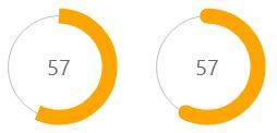
Profiter.