Comment puis-je créer une flèche ronde avec seulement HTML et CSS?
j'essaie de créer une flèche directionnelle ronde avec CSS et HTML. Ci-dessous sont mes tentatives.
tentative 1
Dans ce que j'ai tourné à l' <div> et une flèche, mais les deux sont dans des positions différentes.
voici le CSS:
 #curves div {
   width: 100px;
   height: 100px;
   border: 5px solid #999;
 }
 #curves.width div {
   border-color: transparent transparent transparent #999;
 }
 #curve1 {
   -moz-border-radius: 50px 0 0 50px;
   border-radius: 50px 0 0 50px;
 }
 .arrow-right {
   width: 0;
   height: 0;
   border-top: 10px solid transparent;
   border-bottom: 10px solid transparent;
   border-left: 27px solid #ccc;
   float: right;
   margin-top: -7px;
   margin-right: -26px;
 }
<div id="curves" class="width">
<div id="curve1"></div><span class="arrow-right"></span>
</div>tentative 2
la flèche que j'ai créée est droit.
.container {
  width: 60%;
  height: 9px;
  background: #ccc;
  margin: 100px auto;
  -moz-border-radius: 50px 0 0 50px;
  border-radius: 50px 0 0 50px;
}
.arrow-right {
  width: 0;
  height: 0;
  border-top: 10px solid transparent;
  border-bottom: 10px solid transparent;
  border-left: 27px solid #ccc;
  float: right;
  margin-top: -7px;
  margin-right: -26px;
}
<div class="container">
</span><span class="arrow-right"></span>
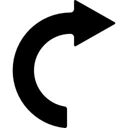
</div>mise à Jour Je veux quelque chose comme ceci
6 réponses
vous pouvez utiliser un pseudo élément pour générer le triangle (en utilisant le fameux border hack).
après cela, vous pourrez utiliser une bordure épaisse sur l'élément réel (avec un border-radius50% pour en faire un cercle). Cela vous permet de tourner la flèche à votre goût.
div {
  border: 20px solid transparent;
  border-top-color: black;
  border-left-color: black;
  height: 100px;
  width: 100px;
  border-radius: 50%;
  position: relative;
  -webkit-transform: rotate(-45deg);
  -ms-transform: rotate(-45deg);
  transform: rotate(-45deg);
  margin:30px auto;
}
div:before {
  content: "";
  position: absolute;
  top: -20px;
  left: 80%;
  height: 0;
  width: 0;
  border-left: 30px solid black;
  border-top: 30px solid transparent;
  border-bottom: 30px solid transparent;
  -webkit-transform: rotate(45deg);
  -ms-transform: rotate(45deg);
  transform: rotate(45deg);
}


/*BELOW IS FOR DEMO ONLY*/

div:hover {
  -webkit-transform: rotate(315deg);
  -ms-transform: rotate(315deg);
  transform: rotate(315deg);
  transition: all 0.8s;
}
html {
  text-align:center;
  color:white;
  font-size:30px;
  height: 100%;
  background: rgb(79, 79, 79);
  /* Old browsers */
  background: -moz-radial-gradient(center, ellipse cover, rgba(79, 79, 79, 1) 0%, rgba(34, 34, 34, 1) 100%);
  /* FF3.6+ */
  background: -webkit-gradient(radial, center center, 0px, center center, 100%, color-stop(0%, rgba(79, 79, 79, 1)), color-stop(100%, rgba(34, 34, 34, 1)));
  /* Chrome,Safari4+ */
  background: -webkit-radial-gradient(center, ellipse cover, rgba(79, 79, 79, 1) 0%, rgba(34, 34, 34, 1) 100%);
  /* Chrome10+,Safari5.1+ */
  background: -o-radial-gradient(center, ellipse cover, rgba(79, 79, 79, 1) 0%, rgba(34, 34, 34, 1) 100%);
  /* Opera 12+ */
  background: -ms-radial-gradient(center, ellipse cover, rgba(79, 79, 79, 1) 0%, rgba(34, 34, 34, 1) 100%);
  /* IE10+ */
  background: radial-gradient(ellipse at center, rgba(79, 79, 79, 1) 0%, rgba(34, 34, 34, 1) 100%);
  /* W3C */
  filter: progid: DXImageTransform.Microsoft.gradient(startColorstr='#4f4f4f', endColorstr='#222222', GradientType=1);
  /* IE6-9 fallback on horizontal gradient */
}
HOVER ME
<div></div>si vous voulez ensuite allonger la flèche, vous pouvez rendre la bordure inférieure visible. Pour exemple;
div {
  border: 20px solid transparent;
  border-top-color: black;
  border-left-color: black;
  border-bottom-color: black;
  height: 100px;
  width: 100px;
  border-radius: 50%;
  position: relative;
  transform: rotate(-45deg);
  margin:30px auto;
}
div:before {
  content: "";
  position: absolute;
  top: -20px;
  left: 80%;
  height: 0;
  width: 0;
  border-left: 30px solid black;
  border-top: 30px solid transparent;
  border-bottom: 30px solid transparent;
  transform: rotate(45deg);
}


/*BELOW IS FOR DEMO ONLY*/

div:hover {
  transform: rotate(315deg);
  transition: all 0.8s;
}
html {
  text-align:center;
  color:white;
  font-size:30px;
  height: 100%;
  background: rgb(79, 79, 79);
  /* Old browsers */
  background: -moz-radial-gradient(center, ellipse cover, rgba(79, 79, 79, 1) 0%, rgba(34, 34, 34, 1) 100%);
  /* FF3.6+ */
  background: -webkit-gradient(radial, center center, 0px, center center, 100%, color-stop(0%, rgba(79, 79, 79, 1)), color-stop(100%, rgba(34, 34, 34, 1)));
  /* Chrome,Safari4+ */
  background: -webkit-radial-gradient(center, ellipse cover, rgba(79, 79, 79, 1) 0%, rgba(34, 34, 34, 1) 100%);
  /* Chrome10+,Safari5.1+ */
  background: -o-radial-gradient(center, ellipse cover, rgba(79, 79, 79, 1) 0%, rgba(34, 34, 34, 1) 100%);
  /* Opera 12+ */
  background: -ms-radial-gradient(center, ellipse cover, rgba(79, 79, 79, 1) 0%, rgba(34, 34, 34, 1) 100%);
  /* IE10+ */
  background: radial-gradient(ellipse at center, rgba(79, 79, 79, 1) 0%, rgba(34, 34, 34, 1) 100%);
  /* W3C */
  filter: progid: DXImageTransform.Microsoft.gradient(startColorstr='#4f4f4f', endColorstr='#222222', GradientType=1);
  /* IE6-9 fallback on horizontal gradient */
}
HOVER ME
<div></div>solution SVG
la forme est vraiment simple à créer en SVG.
Pour le svg intéressés:
<svg width="200px" height="200px" viewbox="0 0 400 400">
  <path stroke="#000" stroke-width="50" fill="none"
        d="M200 350 A 100 100 0 0 1 200 150
           M200 150 200 125 225 150 200 175Z"/>
</svg>j'ai créé cette petite chose dans le CSS, vous pouvez regarder le code pour voir comment il fonctionne.
Remarque::ceci a besoin d'un fond solide.
.arrow {
  width: 200px;
  height: 200px;
  border: 6px solid;
  border-radius: 50%;
  position: relative;
}
.arrow:before {
  content: "";
  display: block;
  width: 10px;
  height: 50px;
  background: #fff;
  position: absolute;
  bottom: 0;
  top: 0;
  right: -6px;
  margin: auto;
}
.arrow:after {
  content: "";
  width: 0;
  height: 0;
  border-left: 20px solid transparent;
  border-right: 20px solid transparent;
  border-top: 20px solid #000;
  position: absolute;
  bottom: 106px;
  right: -20px;
}
<div class="arrow"></div>Voici une autre façon de le faire en utilisant clip-paths au lieu de jouer avec borders.
Démo - http://jsfiddle.net/r8rd0yde/4/
.arrow {
  position: relative;
  padding: 20px;
  width: 100px;
  height: 100px;
}
.circle {
  position: absolute;
  box-sizing: border-box;
  height: 100px;
  width: 100px;
  border: 15px solid #000;
  border-radius: 50%;
  -webkit-clip-path: inset(0 50% 0 0);
  clip-path: inset(0 50% 0 0);
}
.triangle {
  position: absolute;
  width: 35px;
  height: 30px;
  background: #000;
  margin-top: -6px;
  margin-left: 38px;
  -webkit-clip-path: polygon(50% 0, 0% 100%, 100% 100%);
  clip-path: polygon(50% 0, 0% 100%, 100% 100%);
  -moz-transform: rotate(90deg);
  -webkit-transform: rotate(90deg);
  -o-transform: rotate(90deg);
  -ms-transform: rotate(90deg);
  transform: rotate(90deg);
}
/* JUST FOR DEMO */

.arrow:hover {
  -webkit-transform: rotate(720deg);
  -ms-transform: rotate(720deg);
  transform: rotate(720deg);
  transition: all 1.2s;
}
<div class="arrow">
<div class="circle"></div>
<div class="triangle"></div>
</div>Vous pouvez utiliser le flèche circulaire ouverte dans le sens des aiguilles d'une montre (U+21BB) caractère: ↻
.arrow {
  display: inline-block;
  font-size: 300px;
  line-height: 200px;
  font-weight: bold;
  transform: rotate(90deg);
}
<span class="arrow">↻</span>#curvedarrow {
position: relative;
width: 0;
height: 0;
border-top: 9px solid transparent;
border-right: 9px solid red;
-webkit-transform: rotate(10deg);
-moz-transform: rotate(10deg);
-ms-transform: rotate(10deg);
-o-transform: rotate(10deg);
}
#curvedarrow:after {
content: "";
position: absolute;
border: 0 solid transparent;
border-top: 3px solid red;
border-radius: 20px 0 0 0;
top: -12px;
left: -9px;
width: 12px;
height: 12px;
-webkit-transform: rotate(45deg);
-moz-transform: rotate(45deg);
-ms-transform: rotate(45deg);
-o-transform: rotate(45deg);
}
j'ai trouvé ça dans https://css-tricks.com/examples/ShapesOfCSS/
ce n'est peut-être pas la forme exacte que vous voulez, mais c'est certainement un bon point de départ.