CSS Progress Circle [fermé]
j'ai cherché sur ce site pour trouver des barres de progression, mais celles que j'ai pu trouver montrent des cercles animés qui vont à 100%.
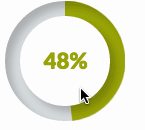
je voudrais qu'il s'arrête à certains pourcentages comme dans la capture d'écran ci-dessous. Est-ce que je peux faire ça en utilisant seulement CSS?
progress bars" src="/images/content/14222138/c8349063be58ca3293a4ef3a5e00881f.png">
4 réponses
j'ai créé un tutoriel sur la façon de faire exactement cela avec CSS3 et la bibliothèque moins JavaScript. Vous pouvez trouver le blogpost ici: https://medium.com/secoya-tech/a917b80c43f9
voici un jsFiddle du résultat final. Le pourcentage est défini par l'attribut data-progress . Les changements sont animés par des transitions CSS.
j'ai créé un violon en utilisant seulement css .
.wrapper {
  width: 100px; /* Set the size of the progress bar */
  height: 100px;
  position: absolute; /* Enable clipping */
  clip: rect(0px, 100px, 100px, 50px); /* Hide half of the progress bar */
}
/* Set the sizes of the elements that make up the progress bar */
.circle {
  width: 80px;
  height: 80px;
  border: 10px solid green;
  border-radius: 50px;
  position: absolute;
  clip: rect(0px, 50px, 100px, 0px);
}
/* Using the data attributes for the animation selectors. */
/* Base settings for all animated elements */
div[data-anim~=base] {
  -webkit-animation-iteration-count: 1;  /* Only run once */
  -webkit-animation-fill-mode: forwards; /* Hold the last keyframe */
  -webkit-animation-timing-function:linear; /* Linear animation */
}

.wrapper[data-anim~=wrapper] {
  -webkit-animation-duration: 0.01s; /* Complete keyframes asap */
  -webkit-animation-delay: 3s; /* Wait half of the animation */
  -webkit-animation-name: close-wrapper; /* Keyframes name */
}

.circle[data-anim~=left] {
  -webkit-animation-duration: 6s; /* Full animation time */
  -webkit-animation-name: left-spin;
}

.circle[data-anim~=right] {
  -webkit-animation-duration: 3s; /* Half animation time */
  -webkit-animation-name: right-spin;
}
/* Rotate the right side of the progress bar from 0 to 180 degrees */
@-webkit-keyframes right-spin {
  from {
    -webkit-transform: rotate(0deg);
  }
  to {
    -webkit-transform: rotate(180deg);
  }
}
/* Rotate the left side of the progress bar from 0 to 360 degrees */
@-webkit-keyframes left-spin {
  from {
    -webkit-transform: rotate(0deg);
  }
  to {
    -webkit-transform: rotate(360deg);
  }
}
/* Set the wrapper clip to auto, effectively removing the clip */
@-webkit-keyframes close-wrapper {
  to {
    clip: rect(auto, auto, auto, auto);
  }
}
<div class="wrapper" data-anim="base wrapper">
<div class="circle" data-anim="base left"></div>
<div class="circle" data-anim="base right"></div>
</div> aussi cochez cette case violon ici (css seulement)
@import url(http://fonts.googleapis.com/css?family=Josefin+Sans:100,300,400);

.arc1 {
    width: 160px;
    height: 160px;
    background: #00a0db;
    -webkit-transform-origin: -31% 61%;
    margin-left: -30px;
    margin-top: 20px;
    -webkit-transform: translate(-54px,50px);
    -moz-transform: translate(-54px,50px);
    -o-transform: translate(-54px,50px);
}
.arc2 {
    width: 160px;
    height: 160px;
    background: #00a0db;
    -webkit-transform: skew(45deg,0deg);
    -moz-transform: skew(45deg,0deg);
    -o-transform: skew(45deg,0deg);
    margin-left: -180px;
    margin-top: -90px;
    position: absolute;
    -webkit-transition: all .5s linear;
    -moz-transition: all .5s linear;
    -o-transition: all .5s linear;
}

.arc-container:hover .arc2 {
    margin-left: -50px;
    -webkit-transform: skew(-20deg,0deg);
    -moz-transform: skew(-20deg,0deg);
    -o-transform: skew(-20deg,0deg);
}

.arc-wrapper {
    width: 150px;
    height: 150px;
    border-radius:150px;
    background: #424242;
    overflow:hidden;
    left: 50px;
    top: 50px;
    position: absolute;
}
.arc-hider {
    width: 150px;
    height: 150px;
    border-radius: 150px;
    border: 50px solid #e9e9e9;
    position:absolute;
    z-index:5;
    box-shadow:inset 0px 0px 20px rgba(0,0,0,0.7);
}

.arc-inset  {
    font-family: "Josefin Sans";
    font-weight: 100;
    position: absolute;
    font-size: 413px;
    margin-top: -64px;
    z-index: 5;
    left: 30px;
    line-height: 327px;
    height: 280px;
    -webkit-mask-image: -webkit-linear-gradient(top, rgba(0,0,0,1), rgba(0,0,0,0.2));
}
.arc-lowerInset {
    font-family: "Josefin Sans";
    font-weight: 100;
    position: absolute;
    font-size: 413px;
    margin-top: -64px;
    z-index: 5;
    left: 30px;
    line-height: 327px;
    height: 280px;
    color: white;
    -webkit-mask-image: -webkit-linear-gradient(top, rgba(0,0,0,0.2), rgba(0,0,0,1));
}
.arc-overlay {
    width: 100px;
    height: 100px;
    background-image: linear-gradient(bottom, rgb(217,217,217) 10%, rgb(245,245,245) 90%, rgb(253,253,253) 100%);
    background-image: -o-linear-gradient(bottom, rgb(217,217,217) 10%, rgb(245,245,245) 90%, rgb(253,253,253) 100%);
    background-image: -moz-linear-gradient(bottom, rgb(217,217,217) 10%, rgb(245,245,245) 90%, rgb(253,253,253) 100%);
    background-image: -webkit-linear-gradient(bottom, rgb(217,217,217) 10%, rgb(245,245,245) 90%, rgb(253,253,253) 100%);

    padding-left: 32px;
    box-sizing: border-box;
    -moz-box-sizing: border-box;
    line-height: 100px;
    font-family: sans-serif;
    font-weight: 400;
    text-shadow: 0 1px 0 #fff;
    font-size: 22px;
    border-radius: 100px;
    position: absolute;
    z-index: 5;
    top: 75px;
    left: 75px;
    box-shadow:0px 0px 20px rgba(0,0,0,0.7);
}
.arc-container {
    position: relative;
    background: #e9e9e9;
    height: 250px;
    width: 250px;
}
<div class="arc-container">
<div class="arc-hider"></div>
<div class="arc-inset">
o
</div>
<div class="arc-lowerInset">
o
</div>
<div class="arc-overlay">
35%
</div>
<div class="arc-wrapper">
<div class="arc2"></div>
<div class="arc1"></div>
</div>
</div>Ou cette belle "1519210920 rond" barre de progression avec HTML5, CSS3 et JavaScript.
Qu'en est-il?
HTML
<div class="chart" id="graph" data-percent="88"></div>
Javascript
var el = document.getElementById('graph'); // get canvas

var options = {
    percent:  el.getAttribute('data-percent') || 25,
    size: el.getAttribute('data-size') || 220,
    lineWidth: el.getAttribute('data-line') || 15,
    rotate: el.getAttribute('data-rotate') || 0
}

var canvas = document.createElement('canvas');
var span = document.createElement('span');
span.textContent = options.percent + '%';

if (typeof(G_vmlCanvasManager) !== 'undefined') {
    G_vmlCanvasManager.initElement(canvas);
}

var ctx = canvas.getContext('2d');
canvas.width = canvas.height = options.size;

el.appendChild(span);
el.appendChild(canvas);

ctx.translate(options.size / 2, options.size / 2); // change center
ctx.rotate((-1 / 2 + options.rotate / 180) * Math.PI); // rotate -90 deg

//imd = ctx.getImageData(0, 0, 240, 240);
var radius = (options.size - options.lineWidth) / 2;

var drawCircle = function(color, lineWidth, percent) {
        percent = Math.min(Math.max(0, percent || 1), 1);
        ctx.beginPath();
        ctx.arc(0, 0, radius, 0, Math.PI * 2 * percent, false);
        ctx.strokeStyle = color;
        ctx.lineCap = 'round'; // butt, round or square
        ctx.lineWidth = lineWidth
        ctx.stroke();
};

drawCircle('#efefef', options.lineWidth, 100 / 100);
drawCircle('#555555', options.lineWidth, options.percent / 100);
et CSS
div {
    position:relative;
    margin:80px;
    width:220px; height:220px;
}
canvas {
    display: block;
    position:absolute;
    top:0;
    left:0;
}
span {
    color:#555;
    display:block;
    line-height:220px;
    text-align:center;
    width:220px;
    font-family:sans-serif;
    font-size:40px;
    font-weight:100;
    margin-left:5px;
}
http://jsfiddle.net/Aapn8/3410 /
le code de base est tiré du simple diagramme circulaire http://rendro.github.io/easy-pie-chart /
une autre solution pure à base de css qui est basée sur deux éléments arrondis que je tourne pour obtenir à l'angle droit:
http://jsfiddle.net/maayan/byT76 /
C'est le css de base qui lui permet:
.clip1 {
    position:absolute;
    top:0;left:0;
    width:200px;
    height:200px;
    clip:rect(0px,200px,200px,100px);
}
.slice1 {
    position:absolute;
    width:200px;
    height:200px;
    clip:rect(0px,100px,200px,0px);
    -moz-border-radius:100px;
    -webkit-border-radius:100px;
    border-radius:100px;
    background-color:#f7e5e1;
    border-color:#f7e5e1;
    -moz-transform:rotate(0);
    -webkit-transform:rotate(0);
    -o-transform:rotate(0);
    transform:rotate(0);
}

.clip2
{
    position:absolute;
    top:0;left:0;
    width:200px;
    height:200px;
    clip:rect(0,100px,200px,0px);
}

.slice2
{
    position:absolute;
    width:200px;
    height:200px;
    clip:rect(0px,200px,200px,100px);
    -moz-border-radius:100px;
    -webkit-border-radius:100px;
    border-radius:100px;
    background-color:#f7e5e1;
    border-color:#f7e5e1;
    -moz-transform:rotate(0);
    -webkit-transform:rotate(0);
    -o-transform:rotate(0);
    transform:rotate(0);
}
et le js le fait tourner selon les besoins.
assez facile à comprendre..
J'espère que ça aidera, Maayan