Bootstrap 4 Alignement vertical Centre et bas de div
j'utilise Bootstrap 4. Le bloc .top doit avoir une largeur de 100% et une hauteur d'écran totale. .top-title doit être au milieu de l'écran. .btn-scroll-down devrait être en bas de l'écran.
je veux que ma page ressemble à 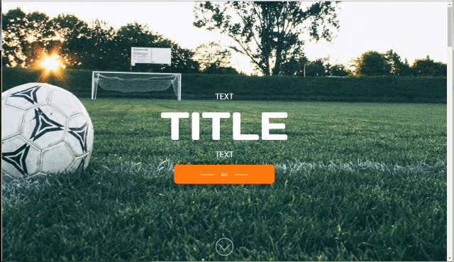
HTML
<!-- top -->
        <div class="top js-top">
            <div class="container h-100">
                <div class="row h-100">

                    <div class="col-lg-12">
                        <h1 class="top-title">
                            <span class="top-title-1">text</span>
                            <span class="top-title-2">title</span>
                            <span class="top-title-3">text</span>
                        </h1>
                        <a href="" class="btn-redirect link-go-to-match">go</a>

                        <a href="#" class="btn-scroll-down js-btn-scroll-down"></a>
                    </div>
                </div>
            </div>
        </div>
    <!-- /top -->
.btn-redirect {
    display: block;
    width: 301px;
    height: 57px;
    margin: 0;
    padding: 20px 0;
    cursor: pointer;
    -webkit-transition: background-color .3s linear;
    -moz-transition: background-color .3s linear;
    -ms-transition: background-color .3s linear;
    -o-transition: background-color .3s linear;
    text-align: center;
    text-transform: uppercase;
    color: #fff;
    border-radius: 10px;
    background-color: #ff780c;
    background-clip: padding-box;
}

.btn-scroll-down {
    position: absolute;
    bottom: 2%;
    left: 50%;
    display: block;
    width: 54px;
    height: 54px;
    margin-left: -27px;
    content: '';
    -webkit-transition: opacity .3s;
    -moz-transition: opacity .3s;
    -ms-transition: opacity .3s;
    -o-transition: opacity .3s;
    opacity: .5;
    border: 3px solid #fff;
    border-radius: 50%;
    background-clip: padding-box;
}

.top
{
    overflow: hidden;
    height: 100%;
    height: 100vh;
    min-height: 100%;
    min-height: 100vh;
    background-image: url(../images/bg_main.jpg);
    background-repeat: no-repeat;
    background-position: 50% 50%;
    background-size: cover;
    background-color: red;
}
.top .top-title
{
    padding-top: 35vh;
    text-align: center;
    text-transform: uppercase;
    color: #fff;
}
.top .top-title .top-title-1
{
    font-family: 'RobotoRegular';
    font-size: 3vh;
    display: block;
}
.top .top-title .top-title-2
{
    font-family: 'DaysOneRegular';
    font-size: 15vh;
    line-height: 1;
    display: block;
    margin-top: 2vh;
}
.top .top-title .top-title-3
{
    font-family: 'RobotoRegular';
    font-size: 3vh;
    display: block;
    margin-top: 2vh;
}
.top .link-go-to-match
{
    margin: 2vh auto 0 auto;
}
https://jsfiddle.net/LL0xm1jg/4 /
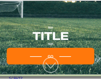
mais sur le petit écran .btn-redirect est placé sur les textes
j'ai essayé d'utiliser les propriétés flex de Bootstrap 4 mais mes tentatives ont échoué. Est-il possible de le faire fonctionner correctement?
1 réponses
utilisez la méthode flexbox . Ajouter une classe de flexbox util pour remplir le récipient en hauteur. Cette classe flex-fill sera incluse dans Bootstrap 4.1 .
.flex-fill {
    flex: 1 1 auto;
}
https://www.codeply.com/go/YUw4uBdG1O
<div class="top js-top vh-100 bg-danger text-white d-flex">
    <div class="container flex-fill">
        <div class="row h-100 align-items-center py-1">
            <div class="col-lg-12 h-100 flex-fill d-flex flex-column align-items-center">
                <div class="my-auto text-center">
                    <h1 class="top-title">
                        <span class="top-title-1">text</span>
                        <span class="top-title-2">title</span>
                        <span class="top-title-3">text</span>
                    </h1>
                    <a href="" class="btn btn-redirect link-go-to-match">go</a>
                </div>
                <a href="#" class="btn-scroll-down js-btn-scroll-down"></a>
            </div>
        </div>
    </div>
</div>
faire le col-lg-12 une colonne flexbox en utilisant d-flex flex-column et puis grouper le bouton H1 et go ensemble dans un div. Utiliser my-auto pour centrez verticalement cette div, et le bouton poussera naturellement vers le bas.