Carte d'un pays avec ggmap et ggplot2
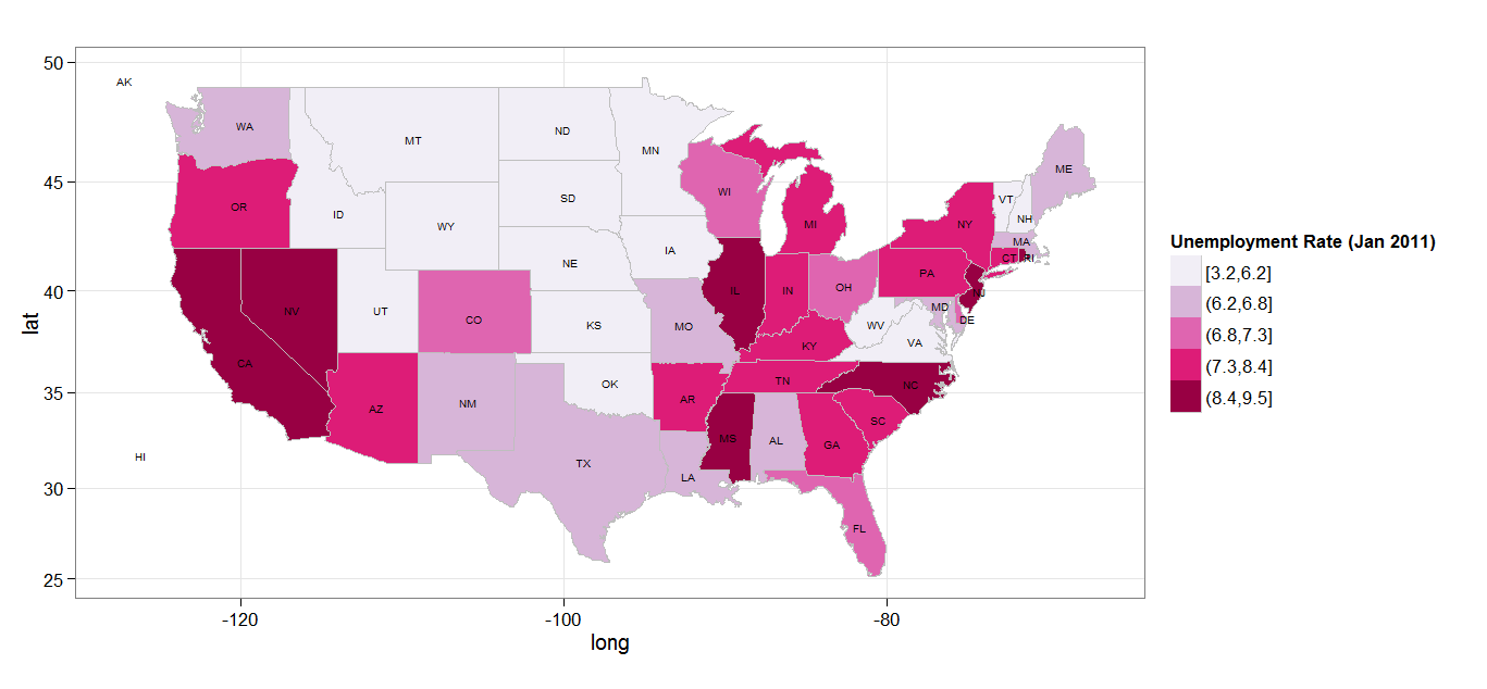
je peux faire le graphique du chômage au niveau de l'Etat des Etats-Unis avec le code suivant.
library(XML)
library(ggplot2)
library(plyr)
library(maps)

unemp <-
  readHTMLTable('http://www.bls.gov/web/laus/laumstrk.htm',
    colClasses = c('character', 'character', 'numeric'))[[2]]

names(unemp) <- c('rank', 'region', 'rate')
unemp$region <- tolower(unemp$region)

us_state_map <- map_data('state')
map_data <- merge(unemp, us_state_map, by = 'region')

map_data <- arrange(map_data, order)

states <- data.frame(state.center, state.abb)

p1 <- ggplot(data = map_data, aes(x = long, y = lat, group = group))
p1 <- p1 + geom_polygon(aes(fill = cut_number(rate, 5)))
p1 <- p1 + geom_path(colour = 'gray', linestyle = 2)
p1 <- p1 + scale_fill_brewer('Unemployment Rate (Jan 2011)', palette  = 'PuRd')
p1 <- p1 + coord_map()
p1 <- p1 + geom_text(data = states, aes(x = x, y = y, label = state.abb, group = NULL), size = 2)
p1 <- p1 + theme_bw()
p1
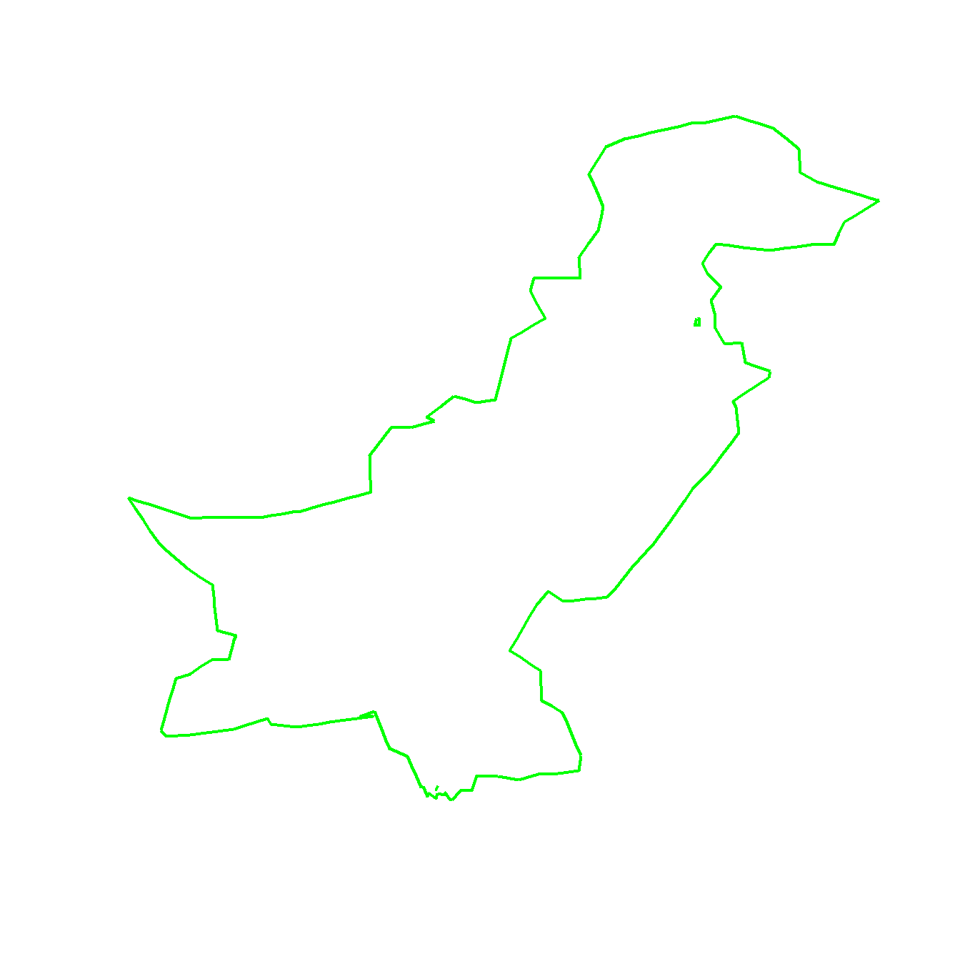
maintenant je veux un graphique similaire pour le Pakistan. Voici les résultats de mes quelques tentatives:
data(world.cities)
Pakistan <- data.frame(map("world", "Pakistan", plot=FALSE)[c("x","y")])

p <- ggplot(Pakistan, aes(x=x, y=y)) +
     geom_path(colour = 'green', linestyle = 2) +
     coord_map() + theme_bw()
p <- p + labs(x=" ", y=" ")
p <- p + theme(panel.grid.minor=element_blank(), panel.grid.major=element_blank())
p <- p + theme(axis.ticks = element_blank(), axis.text.x = element_blank(), axis.text.y = element_blank())
p <- p + theme(panel.border = element_blank())
print(p)
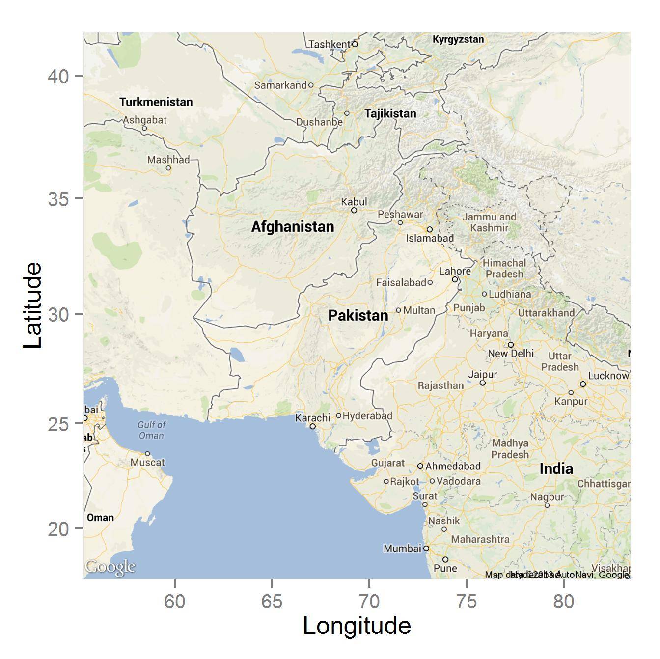
et
library(mapproj)

Country <- "Pakistan"

Get_Map_Country <-
  get_map(
      location = Country
    , zoom = 5
    , scale = "auto"
    , maptype = "roadmap"
    , messaging = FALSE
    , urlonly = FALSE
    , filename = "ggmapTemp"
    , crop = TRUE
    , color = "color"
    , source = "google"
    , api_key
    )

Country1 <-
  ggmap(
      ggmap = Get_Map_Country
    , extent = "panel"
  #  , base_layer
    , maprange = FALSE
    , legend = "right"
    , padding = 0.02
    , darken = c(0, "black")
    )

Country1 <- Country1 + labs(x="Longitude", y="Latitude")
print(Country1)
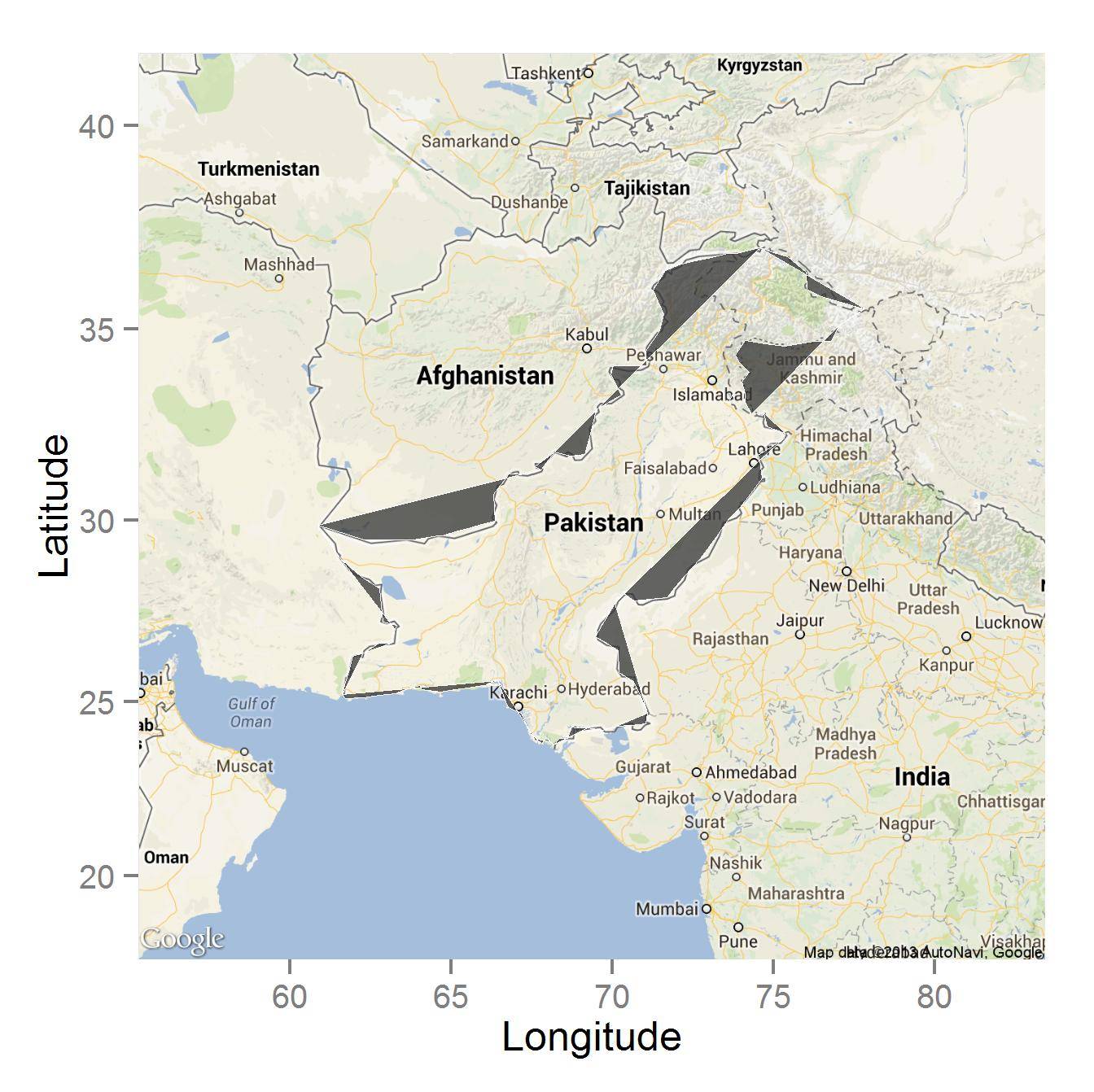
Country2 <- Country1 + geom_polygon(data = Pakistan
                    , aes(x=x, y=y)
                    , color = 'white', alpha = .75, size = .2)

print(Country2)
Questions
je me demande comment obtenir la carte des régions administratives de Le Pakistan, des états-unis. Je sais que nous avons besoin pour cela de la longitude et de la latitude des limites administratives. Je me demande comment obtenir la longitude et la latitude des limites administratives d'un pays. J'ai essayé Zones Administratives Mondiales mais sans succès. Toute aide à cet égard sera grandement appréciée. Merci
2 réponses
Je ne sais pas le niveau spatial des zones administratives dont vous avez besoin, mais voici deux façons pour lire dans les données shapefile et .Formats RData de domaines administratifs mondiaux (gadm.org), et de les convertir en cadres de données pour une utilisation dans ggplot2. De plus, pour reproduire la carte des États-Unis, vous devrez tracer les noms des zones administratives situées aux centroïdes des polygones.
library(ggplot2)
library(rgdal)
Méthode 1. SpatialPolygonDataFrames stockées sous .RData format
# Data from the Global Administrative Areas
# 1) Read in administrative area level 2 data

load("/Users/jmuirhead/Downloads/PAK_adm2.RData")
pakistan.adm2.spdf <- get("gadm")
Method2. Format Shapefile lu avec rgdal:: readOGR
pakistan.adm2.spdf <- readOGR("/Users/jmuirhead/Downloads/PAK_adm", "PAK_adm2",
 verbose = TRUE, stringsAsFactors = FALSE)
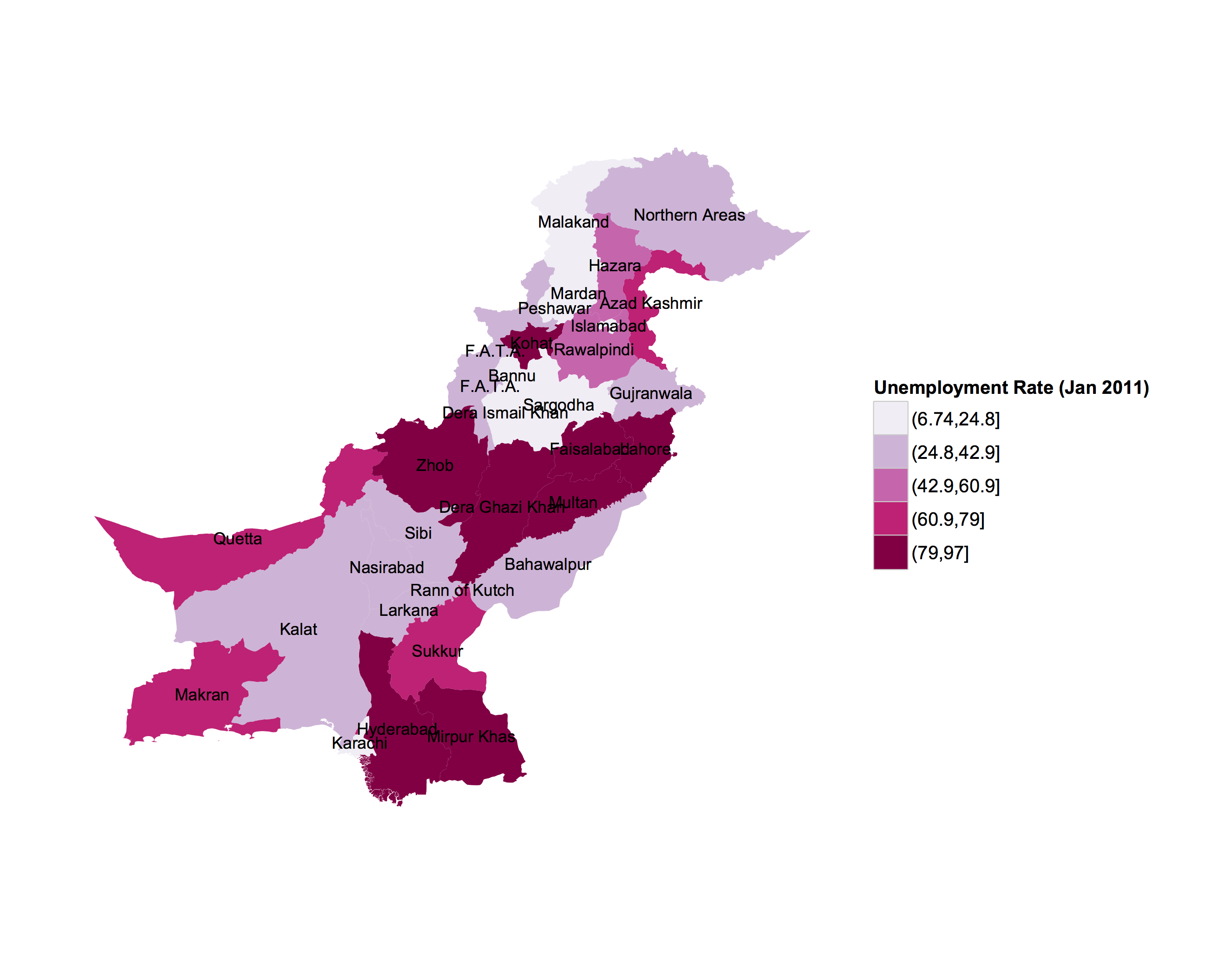
création d'une donnée.frame à partir des images spatialpolygondata et fusion avec une donnée.cadre contenant les informations sur le chômage, par exemple.
pakistan.adm2.df <- fortify(pakistan.adm2.spdf, region = "NAME_2")

# Sample dataframe of unemployment info
unemployment.df <- data.frame(id= unique(pakistan.adm2.df[,'id']),
  unemployment = runif(n = length(unique(pakistan.adm2.df[,'id'])), min = 0, max = 25))

pakistan.adm2.df <- merge(pakistan.adm2.df, unemployment.df, by.y = 'id', all.x = TRUE)
extraire les noms et les centoïdes des zones administratives pour tracer
# Get centroids of spatialPolygonDataFrame and convert to dataframe
# for use in plotting  area names.

pakistan.adm2.centroids.df <- data.frame(long = coordinates(pakistan.adm2.spdf)[, 1],
   lat = coordinates(pakistan.adm2.spdf)[, 2])

# Get names and id numbers corresponding to administrative areas
pakistan.adm2.centroids.df[, 'ID_2'] <- pakistan.adm2.spdf@data[,'ID_2']
pakistan.adm2.centroids.df[, 'NAME_2'] <- pakistan.adm2.spdf@data[,'NAME_2']
Créer ggplot avec des étiquettes pour les zones administratives
p <- ggplot(pakistan.adm2.df, aes(x = long, y = lat, group = group)) + geom_polygon(aes(fill = cut(unemployment,5))) +
geom_text(data = pakistan.adm2.centroids.df, aes(label = NAME_2, x = long, y = lat, group = NAME_2), size = 3) +
labs(x=" ", y=" ") +
theme_bw() + scale_fill_brewer('Unemployment Rate (Jan 2011)', palette  = 'PuRd') +
coord_map() +
theme(panel.grid.minor=element_blank(), panel.grid.major=element_blank()) +
theme(axis.ticks = element_blank(), axis.text.x = element_blank(), axis.text.y = element_blank()) +
theme(panel.border = element_blank())

print(p)